07373f1d5d
Improve issue sidebar UI ( #32587 )
...
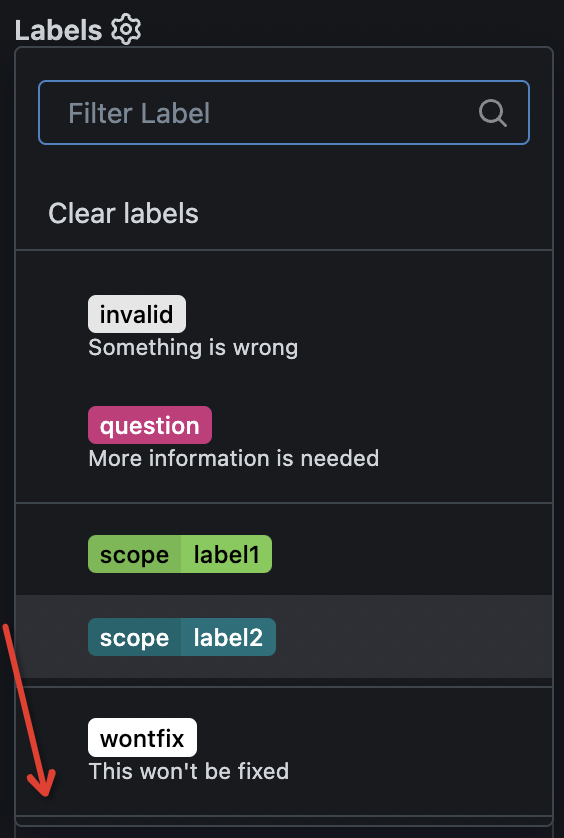
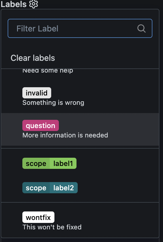
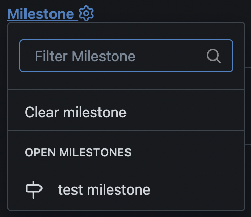
1. remove duplicate dividers
2. align reviewer items
3. merge & remove unused CSS styles
Before:
<details>


</details>
After:
<details>


</details>
2024-11-21 03:31:54 +00:00
18aeca5320
Add reviewers selection to new pull request ( #32403 )
...
Users could add reviewers when creating new PRs.

---------

Co-authored-by: splitt3r <splitt3r@users.noreply.github.com>
Co-authored-by: Sebastian Sauer <sauer.sebastian@gmail.com>
Co-authored-by: bb-ben <70356237+bboerben@users.noreply.github.com>
Co-authored-by: wxiaoguang <wxiaoguang@gmail.com>
2024-11-09 04:48:31 +00:00
6fced33581
Fix dropdown content overflow ( #31610 )
...
close #31602

---------
Co-authored-by: wxiaoguang <wxiaoguang@gmail.com>
2024-10-13 02:43:43 +00:00
f4921b9daa
Simplify 404/500 page ( #31409 )
2024-06-23 17:45:21 +00:00
90bcdf9829
Fix line number widths ( #31341 )
...
Fixes regression
https://github.com/go-gitea/gitea/pull/31307#issuecomment-2162554913
Table CSS is weird. A `auto` value does not work and causes the
regression while any pixel value causes another regression in diff where
the code lines do not stretch. Partially revert that PR and clean up
some related too-deep CSS selectors.
<img width="109" alt="Screenshot 2024-06-12 at 15 07 22"
src="https://github.com/go-gitea/gitea/assets/115237/756c5dea-44b8-49f9-8a08-acef68075f62 ">
<img width="119" alt="Screenshot 2024-06-12 at 15 07 43"
src="https://github.com/go-gitea/gitea/assets/115237/28ae1adc-118e-4016-8d09-033b9f1c9a6f ">
<img width="151" alt="Screenshot 2024-06-12 at 15 07 07"
src="https://github.com/go-gitea/gitea/assets/115237/08db7ed9-de4e-405e-874d-c7ebe3082557 ">
<img width="141" alt="Screenshot 2024-06-12 at 15 07 14"
src="https://github.com/go-gitea/gitea/assets/115237/c4a5492b-1bf1-4773-bc8d-64eb36d823f9 ">
2024-06-12 15:23:42 +00:00
397930d8c1
Fix line number width in code preview ( #31307 )
...
Line numbers were using some hacky CSS `width: 1%` that did nothing to
the code rendering as far as I can tell but broken the inline preview in
markup when line numbers are greater than 2 digits. Also I removed one
duplicate `font-family` rule (it is set below in the `.lines-num,
.lines-code` selector.
2024-06-11 04:54:39 +00:00
2ced31e81d
Change `--border-radius-circle` to `--border-radius-full` ( #30936 )
...
Percentage-based `border-radius` [creates undesirable
ellipse](https://jsfiddle.net/silverwind/j9ko5wnt/4/ ) on non-square
content. Instead, use pixel value and use same wording `full` like
tailwind does, but increast to 99999px over their 9999px.
2024-05-25 14:33:34 +00:00
080486e47d
Fix some UI regressions for commit list ( #30920 )
...
Close #30919

---------

Co-authored-by: silverwind <me@silverwind.io>
2024-05-10 12:58:05 +00:00
eda10cc2bb
Fix some UI problems (dropdown/container) ( #30849 )
...
Follow #30345
Follow #30547

`ellipsis` / `white-space` shouldn't be put on the general dropdown components.
2024-05-06 07:17:22 +00:00
ebe6f4cad7
Fix branch selector UI ( #30803 )
...
Fix #30802
2024-05-02 10:45:23 +00:00
059b2718a5
Right align the "Settings" menu item in overflow-menu ( #30764 )
...
I guess there could be enough people liking to make the Settings menu
item right aligned. As a site admin, I found it's easier to find the
right-aligned Settings menu item.
Tested with various sizes:


2024-04-30 04:26:13 +00:00
a21ca9b5a5
Remove fomantic dimmer module ( #30723 )
...
Tested extensively using modal which is the only dependant.
2024-04-29 14:49:50 +00:00
dd2aaadce3
Fix flash message for flex-container ( #30657 )
2024-04-23 08:31:51 +00:00
aff7b7bdd2
Remove obsolete CSS text classes ( #30576 )
...
- `.text-thin` and `.text-italic` are not present in CSS so were doing nothing and I removed them.
- `.text.middle` was unused so I removed it.
- `.text.italic` is replaced with `tw-italic`.
- `.text.normal` had exactly one use and it wasn't even needed.
- add a `muted` class to the link to `org_profile_avatar.tmpl`.

---------

Co-authored-by: wxiaoguang <wxiaoguang@gmail.com>
2024-04-22 11:21:06 +00:00
1e4867730b
Fix dropdown text ellipsis ( #30628 )
...
Follow
https://github.com/go-gitea/gitea/pull/30547#discussion_r1573866519
Fix #30624
The Fomantic UI Dropdown wasn't designed to work that way, its "text"
element might contain images. So the "overflow" shouldn't be added to
any general dropdown text.

2024-04-21 23:14:33 +00:00
1b1b8500ae
Fix flash on dashboard ( #30572 )
...
Fixes https://github.com/go-gitea/gitea/issues/30566 , regression from
https://github.com/go-gitea/gitea/pull/30214 .
2024-04-21 20:24:56 +00:00
dd8e6ae270
Improve "Reference in new issue" modal ( #30547 )
...
Fixes: https://github.com/go-gitea/gitea/issues/29994
Also some misc enhancements done to the form in the modal.
<img width="840" alt="Screenshot 2024-04-17 at 23 02 55"
src="https://github.com/go-gitea/gitea/assets/115237/e71fba55-55cd-4e48-a497-6b1025c36a43 ">
2024-04-18 19:31:53 +00:00
a658e2f277
Fix long branch name overflows ( #30345 )
...
Fixes: https://github.com/go-gitea/gitea/issues/27971
Fixes: https://github.com/go-gitea/gitea/pull/28010
<img width="689" alt="Screenshot 2024-04-09 at 00 19 57"
src="https://github.com/go-gitea/gitea/assets/115237/7c895a47-274f-40a6-a126-290658f1982d ">
Also fixes a similar issue in issue list where CSS was there but not
active because of missing `display: block`.
<img width="372" alt="Screenshot 2024-04-09 at 00 18 25"
src="https://github.com/go-gitea/gitea/assets/115237/cfbee7cd-2e15-4ac7-96ce-020816f48798 ">
2024-04-16 08:52:45 +00:00
b84baf21fa
Improve flex ellipsis ( #30479 )
...

---------
Co-authored-by: silverwind <me@silverwind.io>
2024-04-14 21:43:30 +02:00
9946353282
Remove fomantic button module ( #30475 )
...
CSS-only module. Button colors are reduced to this:
<img width="639" alt="Screenshot 2024-04-14 at 15 36 07"
src="https://github.com/go-gitea/gitea/assets/115237/882d6c02-d1de-44f2-b707-db02a9f5070d ">
---------
Co-authored-by: wxiaoguang <wxiaoguang@gmail.com>
2024-04-14 17:53:52 +00:00
f3267548ab
Remove fomantic menu module ( #30325 )
...
A lot of variants are in use, so the diff stat isn't so great.

Co-authored-by: Giteabot <teabot@gitea.io>
2024-04-14 11:43:46 +00:00
4b1063f3db
Rewrite and restyle reaction selector and enable no-sizzle eslint rule ( #30453 )
...
Enable `no-sizzle` lint rule, there was only one use in `initCompReactionSelector` and:

- Remove all jQuery except the necessary fomantic dropdown init
- Remove the recursion, instead bind event listeners to common parent container nodes

---------

Co-authored-by: wxiaoguang <wxiaoguang@gmail.com>
Co-authored-by: Giteabot <teabot@gitea.io>
2024-04-14 18:44:11 +08:00
50099d7af4
Various improvements for long file and commit names ( #30374 )
...
Fixes: https://github.com/go-gitea/gitea/issues/29438
This contains numerous enhancements for how large commit messages and
large filenames render. Another notable change is that the file path is
no longer cut off by backend at 30 chars, but rendered in full with
wrapping.
<img width="1329" alt="Screenshot 2024-04-09 at 21 53 57"
src="https://github.com/go-gitea/gitea/assets/115237/5ccbb3d6-643a-4f60-ba79-3572b36d5182 ">
<hr>
<img width="711" alt="Screenshot 2024-04-09 at 21 44 24"
src="https://github.com/go-gitea/gitea/assets/115237/6ffe8fbb-407c-4aa7-b591-3d80daea7d57 ">
<hr>
<img width="439" alt="Screenshot 2024-04-09 at 21 19 03"
src="https://github.com/go-gitea/gitea/assets/115237/1ec7f6e9-2fd8-4841-87eb-6ca02ab9cd61 ">
<hr>
<img width="444" alt="Screenshot 2024-04-09 at 21 18 52"
src="https://github.com/go-gitea/gitea/assets/115237/70931b9e-5841-477e-b3bc-98f8d2662964 ">
---------
Co-authored-by: Giteabot <teabot@gitea.io>
2024-04-10 06:13:22 +00:00
6cac11cb1b
Fix line height on inline code preview ( #30372 )
...
Fixes https://github.com/go-gitea/gitea/issues/30353 .
I don't know what causes `code-inner` to not inherit `line-height` from
its direct parent `.lines-code` but instead from grandparent `.markup`
even thought MDN tells me it's
[inherited](https://developer.mozilla.org/en-US/docs/Web/CSS/line-height#formal_definition ).
This causes no negative impact on other code views, so I think it's the
best solution.
2024-04-10 05:44:48 +00:00
72dc75e594
Reduce checkbox size to 15px ( #30346 )
...
16 seems to big, 14 too small. Let's do 15. Alignment:
<img width="181" alt="image"
src="https://github.com/go-gitea/gitea/assets/115237/f2988611-dee2-492e-a18f-dc5ab3a1cd6c ">
2024-04-09 03:09:43 +00:00
019857a701
Add `--page-spacing` variable, fix admin dashboard notice ( #30302 )
...
Fixes https://github.com/go-gitea/gitea/issues/30293 and introduce the
`--page-spacing` variable which holds the spacing between the elements
on the page. This is working vertically for all pages, including ones
that have fomantic grid, and horizontally for all that use
`flex-container`.
The `.page-content > :first-child:not(.secondary-nav)` selector uses
margin which in some cases enables to adjacent margins to overlap, which
is nice.
<img width="1320" alt="Screenshot 2024-04-06 at 01 35 19"
src="https://github.com/go-gitea/gitea/assets/115237/3e81e707-e9ff-4b7f-a211-3d98f4f85353 ">
---
<img width="1327" alt="Screenshot 2024-04-06 at 01 35 45"
src="https://github.com/go-gitea/gitea/assets/115237/aad196c0-9e21-4c06-ae59-7e33a76c61e1 ">
---
<img width="1321" alt="Screenshot 2024-04-06 at 01 35 31"
src="https://github.com/go-gitea/gitea/assets/115237/785f6c5d-08b6-4e66-aa16-aeca7cfed3ad ">
2024-04-07 15:45:36 +00:00
649aada366
Remove fomantic list module ( #30281 )
...
Likely still some unnecessary CSS but any combinations with the `ui
list` classes are covered. There was only on instance of `horizontal
list` which I removed. It was this part of the commit page:
<img width="396" alt="image"
src="https://github.com/go-gitea/gitea/assets/115237/c49ec4f5-93c3-41d6-a907-cdbedf8abc44 ">
2024-04-06 21:33:45 +00:00
ca5c895efb
Render embedded code preview by permlink in markdown ( #30234 )
...
The permlink in markdown will be rendered as a code preview block, like GitHub

Co-authored-by: silverwind <me@silverwind.io>
2024-04-02 17:48:27 +00:00
ff334749f5
Remove fomantic input module ( #30194 )
...
Another pure CSS module. Some styling is part of the `form` module which
will likely follow next.
2024-03-31 16:06:06 +00:00
8fd15990c5
Remove fomantic checkbox module ( #30162 )
...
CSS is pretty slim already and the `.ui.toggle.checkbox` sliders on
admin page also still work. The only necessary JS is the one that links
`input` and `label` so that it can be toggled via label. All checkboxes
except the markdown ones render at `--checkbox-size: 16px` now.
<img width="174" alt="Screenshot 2024-03-28 at 22 15 10"
src="https://github.com/go-gitea/gitea/assets/115237/3455c1bb-166b-47e4-9847-2d20dd1f04db ">
<img width="499" alt="Screenshot 2024-03-28 at 21 00 07"
src="https://github.com/go-gitea/gitea/assets/115237/412be2b3-d5a0-478a-b17b-43e6bc12e8ce ">
<img width="83" alt="Screenshot 2024-03-28 at 22 14 34"
src="https://github.com/go-gitea/gitea/assets/115237/d8c89838-a420-4723-8c49-89405bb39474 ">
---------
Co-authored-by: delvh <dev.lh@web.de>
2024-03-29 04:56:01 +00:00
dd8dde2be8
replace jquery-minicolors with coloris ( #30055 )
...
Get rid of one more jQuery dependant and have a nicer color picker as
well.
Now there is only a single global color picker init because that is all
that's necessary because the elements are present on the page when the
init code runs. The init is slightly weird because the module only takes
a selector instead of DOM elements directly.
The label modals now also perform form validation because previously it
was possible to trigger a 500 error `Color cannot be empty.` by clearing
out the color value on labels.
<img width="867" alt="Screenshot 2024-03-25 at 00 21 05"
src="https://github.com/go-gitea/gitea/assets/115237/71215c39-abb1-4881-b5c1-9954b4a89adb ">
<img width="860" alt="Screenshot 2024-03-25 at 00 20 48"
src="https://github.com/go-gitea/gitea/assets/115237/a12cb68f-c38b-4433-ba05-53bbb4b1023e ">
2024-03-29 04:00:07 +01:00
e40fc75bac
Render code tags in commit messages ( #30146 )
...
Extend https://github.com/go-gitea/gitea/pull/21432 to commit messages.
Color is changed because the markup code block bg does not offer enough
contrast on varying backgrounds.
<img width="568" alt="Screenshot 2024-03-27 at 19 52 55"
src="https://github.com/go-gitea/gitea/assets/115237/ddc9307e-f32f-4e97-8b88-91f88ced2a36 ">
<img width="573" alt="Screenshot 2024-03-27 at 19 53 33"
src="https://github.com/go-gitea/gitea/assets/115237/14b30fd2-bf28-46b8-9e82-eb60a28f6bf2 ">
<img width="422" alt="Screenshot 2024-03-27 at 19 53 01"
src="https://github.com/go-gitea/gitea/assets/115237/a12136b5-c02b-460c-9830-f830542987ae ">
<img width="397" alt="Screenshot 2024-03-27 at 19 53 27"
src="https://github.com/go-gitea/gitea/assets/115237/c9f05d81-c73e-468e-98e9-e5929bc0da3e ">
<img width="333" alt="Screenshot 2024-03-27 at 19 53 07"
src="https://github.com/go-gitea/gitea/assets/115237/06b5a9f9-f95d-46b6-8c57-df0b02555652 ">
<img width="279" alt="Screenshot 2024-03-27 at 19 53 21"
src="https://github.com/go-gitea/gitea/assets/115237/b06a0afc-ddd8-48ae-b557-a6dc47802e68 ">
2024-03-28 10:42:31 +00:00
226a82a939
Migrate font-family to tailwind ( #30118 )
...
Enable us to use tailwind's
[`font-family`](https://tailwindcss.com/docs/font-family ) classes as
well as remove `gt-mono` in favor of `tw-font-mono`. I also merged the
"compensation" to one selector, previously this was two different values
0.9em and 0.95em. I did not declare a `serif` font because I don't think
there will ever be a use case for those. Command ran:
```sh
perl -p -i -e 's#gt-mono#tw-font-mono#g' web_src/js/**/* templates/**/*
2024-03-28 08:31:07 +00:00
643e6b0958
Remove fomantic label module ( #30081 )
...
Of note is the CSS has references to "floating label" and "transparent
label" but I could not find those anywhere in the code. They are related
to https://github.com/go-gitea/gitea/pull/3939 , but I think these have
long been removed.
---------
Co-authored-by: delvh <dev.lh@web.de>
Co-authored-by: Giteabot <teabot@gitea.io>
2024-03-27 09:58:02 +00:00
f73d891fc4
Remove fomantic table module ( #30047 )
...
Big CSS module. I tested basic functionality on admin and commits table.

---------

Co-authored-by: Giteabot <teabot@gitea.io>
2024-03-25 16:40:50 +01:00
8d93cea296
Remove fomantic segment module ( #30042 )
...
Another CSS-only module. Also, I re-ordered the imports based on
[original fomantic
order](https://github.com/fomantic/Fomantic-UI/blob/2.8.7/src/semantic.less ).
2024-03-24 16:48:06 +00:00
2d281704de
Remove fomantic container module ( #30036 )
...
Small CSS module. There was a ordering conflict between `.ui.menu` and
`.ui.container` which I've solved by adding the `.ui.menu` rule into
base.

---------

Co-authored-by: Giteabot <teabot@gitea.io>
2024-03-24 14:04:18 +00:00
f22fe4e194
Remove fomantic header module ( #30033 )
...
Likely still a few useless classes left, but I think I at least don't
have missed any.

---------

Co-authored-by: delvh <dev.lh@web.de>
Co-authored-by: Giteabot <teabot@gitea.io>
2024-03-24 14:32:19 +01:00
db01bf6cc8
Various code view improvements ( #30014 )
...
1. Restore missing styles for message close icon
2. Move `code-line-button` so that it does not go off-screen on small
viewports
3. Make `code-line-button` look and behave like other buttons
4. Make `code-line-button` work in blame
5. Make the active selection span the whole line, not just the code part
6. Tweak colors, make dark theme code bg darker, make line numbers same
color in diff and file view.
7. Move code background to parent, fixing border radius and other
problems
8. Enable code wrap in blame
9. Improve blame responsiveness
10. Remove `--color-code-sidebar-bg` in blame, now it uses same
background as code
11. Rename `--color-active-line` to `--color-highlight-bg`
12. Add `--color-highlight-bg`
13. Fix button group borders on hover and border-right on last button.
<img width="1343" alt="Screenshot 2024-03-23 at 22 34 13"
src="https://github.com/go-gitea/gitea/assets/115237/fcbb919f-5dc3-43f0-97f6-870d6f412554 ">
<img width="1334" alt="Screenshot 2024-03-23 at 22 34 26"
src="https://github.com/go-gitea/gitea/assets/115237/ca44c3b7-4328-4645-ba49-b0dc6a5ac06d ">
<img width="1338" alt="Screenshot 2024-03-23 at 22 34 57"
src="https://github.com/go-gitea/gitea/assets/115237/00eb0b5a-1ec7-4669-a94a-4602b9d1c1ac ">
<img width="1337" alt="Screenshot 2024-03-23 at 22 34 42"
src="https://github.com/go-gitea/gitea/assets/115237/752edc4a-064f-413c-9dff-c086187fcd85 ">
Fixes: https://github.com/go-gitea/gitea/issues/18074
2024-03-24 12:14:03 +00:00
3ccda41a53
Introduce `.secondary-nav` and handle `.page-content` spacing universally ( #29982 )
...
Fixes: https://github.com/go-gitea/gitea/issues/29981 . Introduce
`.secondary-nav` as a universal way for styling and margin adjustments
inside `.page-content`.
If the first child of `.page-content` is `.secondary-nav`, we add margin
below it, otherwise we add padding to the first child. Notable changes:
- `--color-header-wrapper` is replaced with `--color-secondary-nav-bg`.
- `navbar` class is removed.
---------
Co-authored-by: Giteabot <teabot@gitea.io>
Co-authored-by: wxiaoguang <wxiaoguang@gmail.com>
2024-03-22 23:54:09 +00:00
6845717158
Remove fomantic site module ( #29980 )
...
Had to fiddle a bit with the css ordering, but seems to work well now
and should render exactly like before. Some of the CSS may be
unnecessary, but I kept it for now.
2024-03-22 11:47:50 +00:00
bfa160fc98
Refactor repo header/list ( #29969 )
...
1. Use general "mobile-only" and "not-mobile" CSS styles, remove some`@media (max-width: 767.98px)` tricks
2. Use `CountFmt` for repo list, just like the repo header (and it matches GitHub, to avoid big numbers bloat the page)
2024-03-21 17:04:03 +00:00
d6fed9ab88
Fix various loading states, remove `.loading` class ( #29920 )
...
Various code was using fomantic `loading` class which I think got broken
a while ago and rendered only a full circle. Fix those to use
`is-loading`.
Before:
<img width="295" alt="Screenshot 2024-03-19 at 22 56 26"
src="https://github.com/go-gitea/gitea/assets/115237/dbe83395-5db4-4868-90bc-3613866a35f0 ">
After:
<img width="60" alt="Screenshot 2024-03-19 at 22 54 35"
src="https://github.com/go-gitea/gitea/assets/115237/8ac19b7e-035a-4c6d-850b-53a234ef69c2 ">
<img width="294" alt="Screenshot 2024-03-19 at 22 54 56"
src="https://github.com/go-gitea/gitea/assets/115237/34e819d7-25f7-43a1-9d48-4a68dcd2b6ad ">
<img width="320" alt="Screenshot 2024-03-19 at 22 55 16"
src="https://github.com/go-gitea/gitea/assets/115237/05127544-47ff-4e18-9fd8-c84e44c374f8 ">
<img width="153" alt="Screenshot 2024-03-19 at 23 01 43"
src="https://github.com/go-gitea/gitea/assets/115237/a33248c6-b11d-40ff-82d8-f5a3d85b55aa ">
<img width="1300" alt="Screenshot 2024-03-19 at 23 56 25"
src="https://github.com/go-gitea/gitea/assets/115237/562ca876-b5d5-4295-961e-9d2cdab31ab0 ">
<img width="136" alt="Screenshot 2024-03-20 at 00 00 38"
src="https://github.com/go-gitea/gitea/assets/115237/44838ac4-67f3-4fec-a8e3-978cc5dbdb72 ">
2024-03-21 16:31:15 +00:00
97b078d226
Add background to dashboard navbar, fix missing padding ( #29940 )
...
Two small CSS fixes:
1. Add background and reduced padding/avatar size to dashboard navbar.
We use that background already in a number of "secondary navbars", so it
fits.
<img width="1344" alt="Screenshot 2024-03-20 at 18 18 21"
src="https://github.com/go-gitea/gitea/assets/115237/ce5ebedc-e607-42c7-b7b4-b7a4c0ee68f2 ">
2. Fix padding on top of user settings and subscriptions, regressed by
https://github.com/go-gitea/gitea/pull/29922 .
2024-03-20 18:33:00 +00:00
99d7ef5091
Prevent layout shift in `<overflow-menu>` items ( #29831 )
...
There is a small layout shift in when active tab changes. Notice how the
actions SVG is unstable:

This is because the active item with bold text is wider then the
inactive one. I have applied [this
trick](https://stackoverflow.com/a/32570813/808699 ) to prevent this
layout shift. It's only active inside `<overflow-menu>` because I wanted
to avoid changing HTML and doing it in regular JS would cause a flicker.
I don't expect us to introduce other similar menus without
`<overflow-menu>`, so that place is likely fine.

I also changed the weight from 500 to 600, slightly reduced horizontal
padding, merged some tab-bar related CSS rules and a added a small
margin below repo-header so it does not look so crammed against the
buttons on top.
---------
Co-authored-by: wxiaoguang <wxiaoguang@gmail.com>
2024-03-20 17:00:35 +00:00
8cad44f410
Remove the negative margin from `.page-content` ( #29922 )
...
The negative margin was suboptimal and presents a few unnecessary
challenges while styling the page. Remove it and add custom margin
values, which slightly changes the height a few things near the top of
the page as well:
15px less height of explore and login navbar:
<img width="899" alt="Screenshot 2024-03-20 at 00 52 34"
src="https://github.com/go-gitea/gitea/assets/115237/72a01ca4-5d17-4a0f-b915-61f95054fcb1 ">
15px reduced padding-top height of "user bar" and equal 4px padding
added:
<img width="484" alt="Screenshot 2024-03-20 at 00 52 50"
src="https://github.com/go-gitea/gitea/assets/115237/a8507e6d-372d-4a8b-9048-66fcf8a5facd ">
3px less padding on top of repo:
<img width="552" alt="Screenshot 2024-03-20 at 00 53 49"
src="https://github.com/go-gitea/gitea/assets/115237/dede6e44-7688-440f-a1b6-13532638ae03 ">
2024-03-20 11:21:18 +00:00
5a8559ec47
Fix border on focus in dashboard repo search ( #29893 )
...
Before:
<img width="449" alt="Screenshot 2024-03-18 at 22 35 10"
src="https://github.com/go-gitea/gitea/assets/115237/f2893870-e7a3-4e34-b0cf-4610735c9b36 ">
After:
<img width="453" alt="image"
src="https://github.com/go-gitea/gitea/assets/115237/36a9f800-28a4-40fc-b6d2-a2e717ddba01 ">
2024-03-19 10:36:54 +00:00
4e547822f3
Remove fomantic message module ( #29856 )
...
Remove this CSS-only module, which gives a nice reduction in CSS size.
Should look exactly like before.
2024-03-17 11:21:14 +08:00
ffeaf2d0bd
add `.suppressed` link class ( #29847 )
...
Extract from https://github.com/go-gitea/gitea/pull/29344 . With this
class it's possible to have links that don't color on hover. It will be
useful for https://github.com/go-gitea/gitea/pull/29429 .
2024-03-16 17:58:58 +01:00
66902d89e5
Refactor markdown attention render ( #29833 )
...
* Remove some deadcode
* Use 2-word name for CSS class names
* Remove "gt-*" rules for sanitizer

The UI doesn't change much.
2024-03-16 11:34:38 +00:00