Commit Graph

437 Commits

Author SHA1 Message Date
wxiaoguang 10c7996b5a
Remove RenderEmojiPlain from template helper (#29375)
RenderEmojiPlain(emoji.ReplaceAliases) should be called explicitly for
some contents, but not for everything.

Actually in modern days, in most cases it doesn't need such
"ReplaceAliases". So only keep it for issue/PR titles.

If anyone really needs to do ReplaceAliases for some contents, I will
propose a following fix.
2024-02-24 22:34:51 +00:00
wxiaoguang 567a68a0bf
Remove DataRaceCheck (#29258)
Since #26254, it started using `{{ctx.Locale.Tr ...}}`

Now the `ctx` seems stable enough, so the check could be removed.
2024-02-19 11:25:58 +00:00
Yarden Shoham c70f65e83b
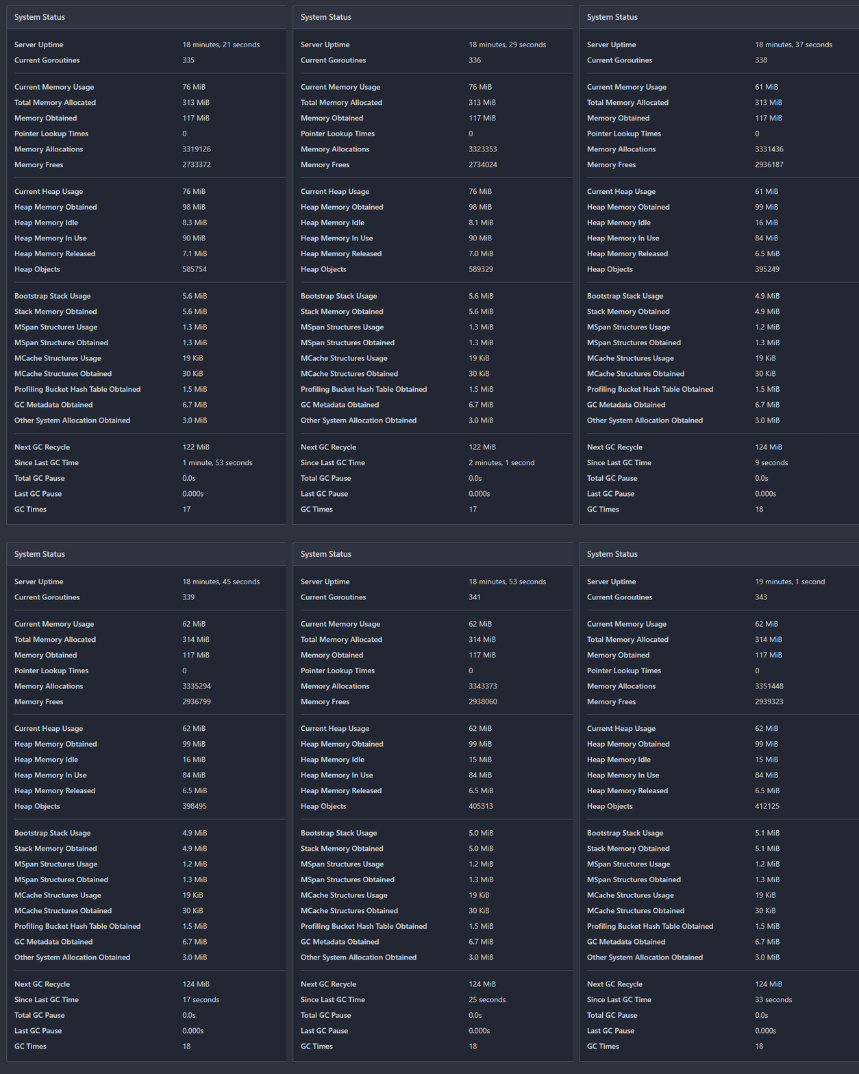
Auto-update the system status in admin dashboard (#29163)
- Refactor the system status list into its own template
- Change the backend to return only the system status if htmx initiated
the request
- `hx-get="{{$.Link}}/system_status`: reuse the backend handler
- `hx-swap="innerHTML"`: replace the `<div>`'s innerHTML (essentially
the new template)
- `hx-trigger="every 5s"`: call every 5 seconds
- `hx-indicator=".divider"`: the `is-loading` class shouldn't be added
to the div during the request, so set it on an element it has no effect
on
- Render "Since Last GC Time" with `<relative-time>`, so we send a
timestamp

# Auto-update in action GIF
![action](https://github.com/go-gitea/gitea/assets/20454870/c6e1f220-f0fb-4460-ac3b-59f315e30e29)

---------

Signed-off-by: Yarden Shoham <git@yardenshoham.com>
Co-authored-by: silverwind <me@silverwind.io>
2024-02-16 02:52:25 +00:00
Yarden Shoham 3e8414179c
Introduce htmx and use it to avoid full page load on `Subscribe` and `Follow` (#28908)
- Closes https://github.com/go-gitea/gitea/issues/28880

This change introduces htmx with the hope we could use it to make Gitea
more reactive while keeping our "HTML rendered on the server" approach.

- Add `htmx.js` that imports `htmx.org` and initializes error toasts
- Place `hx-headers='{"x-csrf-token": "{{.CsrfToken}}"}'` on the
`<body>` tag so every request that htmx sends is authenticated
- Place `hx-swap="outerHTML"` on the `<body>` tag so the response of
each htmx request replaces the tag it targets (as opposed to its inner
content)
- Place `hx-push-url="false"` on the `<body>` tag so no changes to the
URL happen in `<form>` tags
- Add the `is-loading` class during request

### Error toasts in action


![errors](https://github.com/go-gitea/gitea/assets/20454870/181a1beb-1cb8-4858-abe8-fa1fc3f5b8f3)

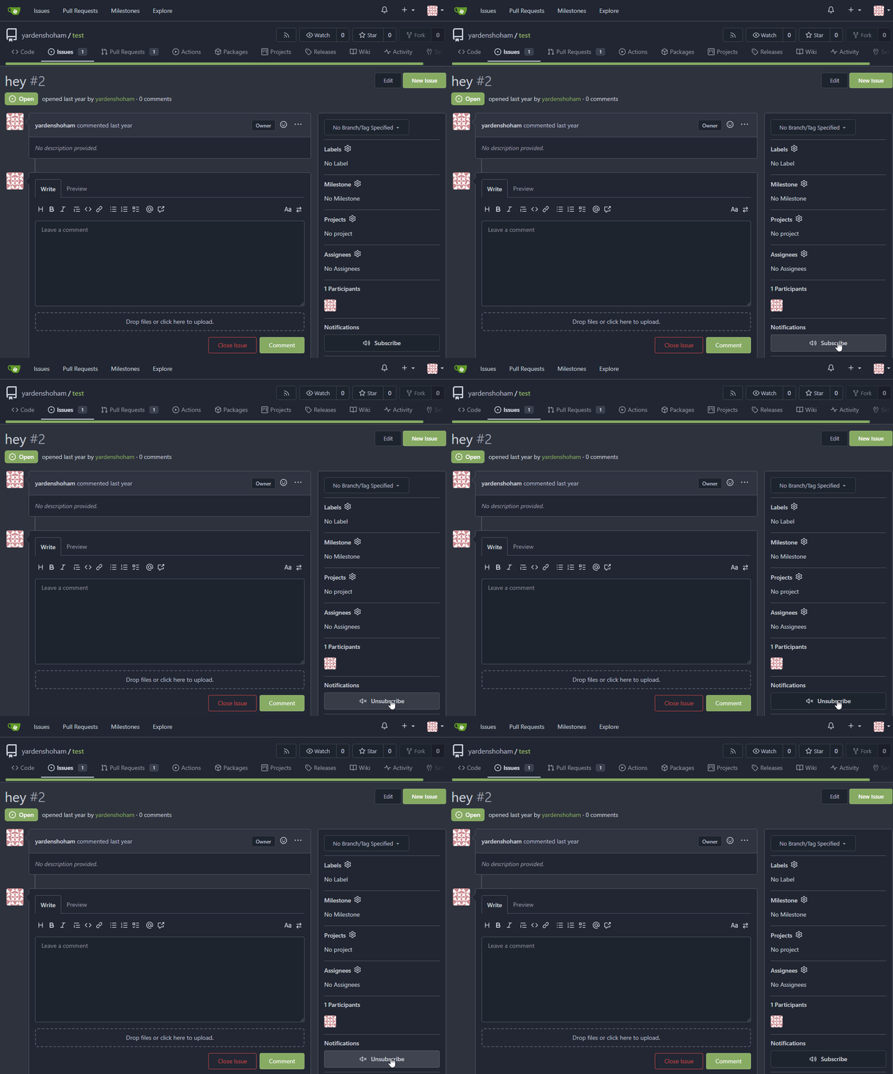
## Don't do a full page load when clicking the subscribe button
- Refactor the form around the subscribe button into its own template
- Use htmx to perform the form submission
- `hx-boost="true"` to prevent the default form submission behavior of a
full page load
- `hx-sync="this:replace"` to replace the current request (in case the
button is clicked again before the response is returned)
  - `hx-target="this"` to replace the form tag with the new form tag
- Change the backend response to return a `<form>` tag instead of a
redirect to the issue page

### Before

![subscribe_before](https://github.com/go-gitea/gitea/assets/20454870/cb2439a2-c3c0-425c-8d3c-5d646b1cdc28)

### After


![subscribe_after](https://github.com/go-gitea/gitea/assets/20454870/6fcd77d8-7b11-40b0-af4f-b152aaad787c)

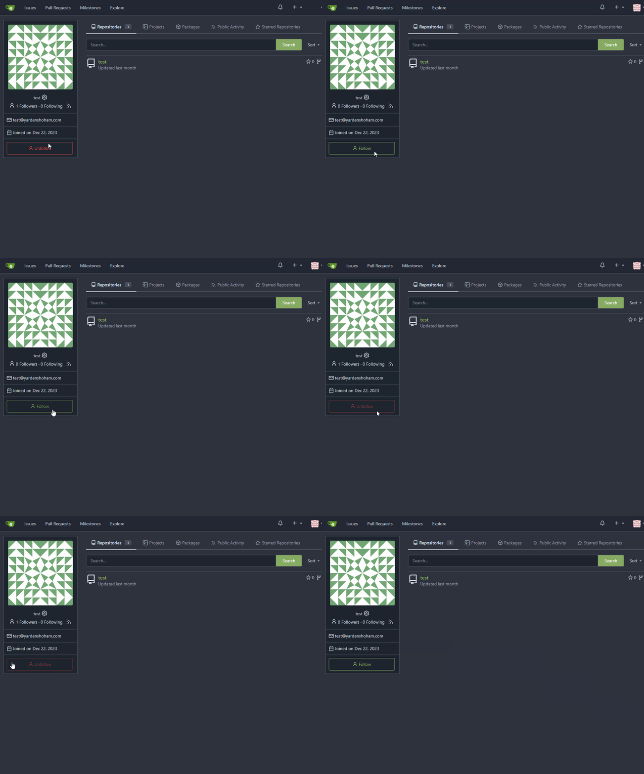
## Don't do a full page load when clicking the follow button
- Use htmx to perform the button request
- `hx-post="{{.ContextUser.HomeLink}}?action=follow"` to send a POST
request to follow the user
- `hx-target="#profile-avatar-card"` to target the card div for
replacement
- `hx-indicator="#profile-avatar-card"` to place the loading indicator
on the card
- Change the backend response to return a `<div>` tag (the card) instead
of a redirect to the user page

### Before

![follow_before](https://github.com/go-gitea/gitea/assets/20454870/a210b643-6e74-4ff9-8e61-d658c62edf1f)

### After


![follow_after](https://github.com/go-gitea/gitea/assets/20454870/5bb19ae9-0d59-4ae3-b538-4c83334e4722)

---------

Signed-off-by: Yarden Shoham <git@yardenshoham.com>
Co-authored-by: 6543 <m.huber@kithara.com>
Co-authored-by: Giteabot <teabot@gitea.io>
2024-01-30 15:45:54 +01:00
wxiaoguang a04f8c0f81
Move the captcha script loader to the template which really needs it (#28718)
It improves the maintainability for the templates.

Now `base/footer.tmpl` doesn't need to depend on "captcha" feature.
2024-01-07 15:41:46 +00:00
wxiaoguang c5901b622d
Avoid unnecessary 500 panic when a commit doesn't exist (#28719)
In #26851, it assumed that `Commit` always exists when
`PageIsDiff==true`.

But for a 404 page, the `Commit` doesn't exist, so the following code
would cause panic because nil value can't be passed as string parameter
to `IsMultilineCommitMessage(string)` (or the StringUtils.Cut in later
PRs)
2024-01-07 18:20:22 +08:00
silverwind 023e937141
Rename the default themes to gitea-light, gitea-dark, gitea-auto (#27419)
Part of https://github.com/go-gitea/gitea/issues/27097:

- `gitea` theme is renamed to `gitea-light`
- `arc-green` theme is renamed to `gitea-dark`
- `auto` theme is renamed to `gitea-auto`

I put both themes in separate CSS files, removing all colors from the
base CSS. Existing users will be migrated to the new theme names. The
dark theme recolor will follow in a separate PR.

## ⚠️ BREAKING ⚠️

1. If there are existing custom themes with the names `gitea-light` or
`gitea-dark`, rename them before this upgrade and update the `theme`
column in the `user` table for each affected user.
2. The theme in `<html>` has moved from `class="theme-name"` to
`data-theme="name"`, existing customizations that depend on should be
updated.

---------

Co-authored-by: Lunny Xiao <xiaolunwen@gmail.com>
Co-authored-by: Giteabot <teabot@gitea.io>
2023-10-06 09:46:36 +02:00
wxiaoguang 93bd4351bf
Fix more "locale" usages (#27259) 2023-09-25 20:42:40 +08:00
delvh 7960ba7e2b
Always use `ctx.Locale.Tr` inside templates (#27231) 2023-09-25 08:56:50 +00:00
Denys Konovalov 2325fe777d
cleanup locale function usage (#27227) 2023-09-24 20:31:58 +00:00
silverwind 8099238618
Change green buttons to primary color (#27099)
I think it's better if the primary actions have primary color instead of
green which fits better into the overall single-color UI design. This PR
currently replaces every green button with primary:

<img width="141" alt="Screenshot 2023-09-16 at 14 07 59"
src="https://github.com/go-gitea/gitea/assets/115237/843c1e50-4fb2-4ec6-84ba-0efb9472dcbe">
<img width="161" alt="Screenshot 2023-09-16 at 14 07 51"
src="https://github.com/go-gitea/gitea/assets/115237/9442195a-a3b2-4a42-b262-8377d6f5c0d1">

Modal actions now use uncolored/primary instead of previous green/red
colors. I also removed the box-shadow on all basic buttons:

<img width="259" alt="Screenshot 2023-09-16 at 14 16 39"
src="https://github.com/go-gitea/gitea/assets/115237/5beea529-127a-44b0-8d4c-afa7b034a490">
<img width="261" alt="Screenshot 2023-09-16 at 14 17 42"
src="https://github.com/go-gitea/gitea/assets/115237/4757f7b2-4d46-49bc-a797-38bb28437b88">

The change currently includes the "Merge PR" button, for which we might
want to make an exception to match the icon color there:

<img width="442" alt="Screenshot 2023-09-16 at 14 33 53"
src="https://github.com/go-gitea/gitea/assets/115237/993ac1a5-c94d-4895-b76c-0d872181a70b">
2023-09-18 22:05:31 +00:00
techknowlogick e67ddaa0f8
update footer link to new landing page (#26916)
as title

Co-authored-by: Giteabot <teabot@gitea.io>
2023-09-05 16:44:07 +00:00
wxiaoguang c802c46a9b
Refactor `og:description` to limit the max length (#26876)
1. The `og:description` should be "a one to two sentence description of
your object"
* It shouldn't output all the user inputted content -- it would be
pretty huge.
    * Maybe it only needs at most 300 bytes.
2. Do not render commit message as HTML
2023-09-03 01:43:29 +00:00
Linus Groh 5743d7cb5b
Improve opengraph previews (#26851)
Add more useful Open Graph metadata for commit and file URLs:

- Set `og:title` to the page title, which is a concise summary in both
cases (`<commit message> · <commit hash>` and `<filename> at <branch>`,
respectively)
- Set `og:description` to the commit message body, if available
- Set `og:url` to the relevant URLs instead of the repo URL

Also move the relevant meta tags into a separate template as they now
take up the majority of the base head template.
2023-09-01 16:59:24 +00:00
silverwind 02efd99010
Move licenses.txt to /assets directory (#26866)
Now that we have the `/assets` directory, we can put`licenses.txt`
directly into it instead of incorrect `/js` path which was previously
only done to avoid reserving a username.

---------

Co-authored-by: Giteabot <teabot@gitea.io>
2023-09-01 14:42:33 +00:00
Lunny Xiao 476b9d1589
Use docs.gitea.com instead of docs.gitea.io (#26739) 2023-08-27 11:59:12 +00:00
yp05327 a4a567f29f
Check disabled workflow when rerun jobs (#26535)
In GitHub, we can not rerun jobs if the workflow is disabled.

---------

Co-authored-by: silverwind <me@silverwind.io>
Co-authored-by: wxiaoguang <wxiaoguang@gmail.com>
2023-08-22 10:30:02 +08:00
wxiaoguang a370efc13f
Use template context function for avatar rendering (#26385)
Introduce `AvatarUtils`, no need to pass `$.Context` to every
sub-template, and simplify the template helper functions.
2023-08-10 11:19:39 +08:00
wxiaoguang 6913053223
Start using template context function (#26254)
Before:

* `{{.locale.Tr ...}}`
* `{{$.locale.Tr ...}}`
* `{{$.root.locale.Tr ...}}`
* `{{template "sub" .}}`
* `{{template "sub" (dict "locale" $.locale)}}`
* `{{template "sub" (dict "root" $)}}`
* .....

With context function: only need to `{{ctx.Locale.Tr ...}}`

The "ctx" could be considered as a super-global variable for all
templates including sub-templates.


To avoid potential risks (any bug in the template context function
package), this PR only starts using "ctx" in "head.tmpl" and
"footer.tmpl" and it has a "DataRaceCheck". If there is anything wrong,
the code can be fixed or reverted easily.
2023-08-08 01:22:47 +00:00
silverwind 61e0d1a767
Enable H014 and H023 djlint rules (#25786)
Enable these rules:

- H014 | More than 2 blank lines.
- H023 | Do not use entity references.

There are more potential rules to enable but they are blocked by bugs in
the linter:

- https://github.com/Riverside-Healthcare/djLint/issues/711
- https://github.com/Riverside-Healthcare/djLint/issues/712
2023-07-09 20:33:25 +00:00
wxiaoguang b6693a2c9a
Align language menu icon and fit the footer area (#25556)
Close #25551
2023-06-28 14:57:50 +00:00
wxiaoguang ddf96f68cc
Use JSON response for "user/logout" (#25522)
The request sent to "user/logout" is from "link-action", it expects to
get JSON response.
2023-06-26 21:36:10 +02:00
silverwind be47015229
Navbar fixes (#25402)
Fixes: https://github.com/go-gitea/gitea/issues/25444

Followup for some regressions from
https://github.com/go-gitea/gitea/pull/25343. Before and after:

<img width="219" alt="Screenshot 2023-06-21 at 00 25 20"
src="https://github.com/go-gitea/gitea/assets/115237/08fe8e01-0a16-4cdf-ad4d-0a9048408e9e">
<img width="220" alt="Screenshot 2023-06-21 at 00 25 32"
src="https://github.com/go-gitea/gitea/assets/115237/be25ae69-6ed0-4af5-8eeb-d7b210e7c124">

Fixes mobile button background and margins:

<img width="836" alt="Screenshot 2023-06-21 at 00 39 58"
src="https://github.com/go-gitea/gitea/assets/115237/d76ac1e9-747f-477c-9a42-b73e129b72ee">
2023-06-24 04:31:39 +00:00
silverwind e50c3e8431
Navbar styling rework (#25343)
- Extract navbar CSS to own file
- Reduce height from 52px to 50px
- Give every item a hover effect of of 36px, including the logo and on
mobile
- Consistent horizontal padding of 10px left and right

<img width="549" alt="Screenshot 2023-06-18 at 13 41 16"
src="https://github.com/go-gitea/gitea/assets/115237/0b00d101-253e-4b1f-9ee2-322d60fb2e26">

<img width="98" alt="Screenshot 2023-06-18 at 14 03 43"
src="https://github.com/go-gitea/gitea/assets/115237/4ef5d98b-4d1e-45de-822e-c2c844e19876">
<img width="234" alt="Screenshot 2023-06-18 at 14 03 18"
src="https://github.com/go-gitea/gitea/assets/115237/a4d9b04b-83de-42aa-a9ce-f010a9690688">

<img width="873" alt="Screenshot 2023-06-18 at 13 58 28"
src="https://github.com/go-gitea/gitea/assets/115237/8cb8e31e-2adf-40c8-ae3f-d00d011b4d1b">

---------

Co-authored-by: wxiaoguang <wxiaoguang@gmail.com>
Co-authored-by: Giteabot <teabot@gitea.io>
2023-06-20 20:35:25 +00:00
silverwind ef6f5f0124
rename tributeValues to mentionValues (#25375)
Very simple change, just rename this variable so it does not feature the
name of the module.
2023-06-20 03:32:49 +00:00
silverwind e24f651c86
Add template linting via djlint (#25212)
So I found this [linter](https://github.com/Riverside-Healthcare/djlint)
which features a mode for go templates, so I gave it a try and it did
find a number of valid issue, like unbalanced tags etc. It also has a
number of bugs, I had to disable/workaround many issues.

Given that this linter is written in python, this does add a dependency
on `python` >= 3.8 and `poetry` to the development environment to be
able to run this linter locally.

- `e.g.` prefixes on placeholders are removed because the linter had a
false-positive on `placeholder="e.g. cn=Search"` for the `attr=value`
syntax and it's not ideal anyways to write `e.g.` into a placeholder
because a placeholder is meant to hold a sample value.
- In `templates/repo/settings/options.tmpl` I simplified the logic to
not conditionally create opening tags without closing tags because this
stuff confuses the linter (and possibly the reader as well).
2023-06-14 18:17:58 +00:00
wxiaoguang 6bbccdd177
Improve AJAX link and modal confirm dialog (#25210)
Clarify the "link-action" behavior:

>  // A "link-action" can post AJAX request to its "data-url"
> // Then the browser is redirect to: the "redirect" in response, or
"data-redirect" attribute, or current URL by reloading.

And enhance the "link-action" to support showing a modal dialog for
confirm. A similar general approach could also help PRs like
https://github.com/go-gitea/gitea/pull/22344#discussion_r1062883436

> // If the "link-action" has "data-modal-confirm(-html)" attribute, a
confirm modal dialog will be shown before taking action.


And a lot of duplicate code can be removed now. A good framework design
can help to avoid code copying&pasting.

---------

Co-authored-by: silverwind <me@silverwind.io>
2023-06-13 12:10:10 +00:00
silverwind 6a075589bf
Fix mobile navbar and misc cleanups (#25134)
- Fix and improve mobile navbar layout
- Apply all cleanups suggested in
https://github.com/go-gitea/gitea/pull/25111
- Make media query breakpoints match Fomantic's exactly
- Clean up whitespace in class on navbar items

Mobile navbar before and after:
<img width="745" alt="Screenshot 2023-06-08 at 08 40 56"
src="https://github.com/go-gitea/gitea/assets/115237/ca84b239-b10f-41db-8c06-dcf2b6dd9d28">
<img width="739" alt="Screenshot 2023-06-08 at 08 41 23"
src="https://github.com/go-gitea/gitea/assets/115237/09133c54-eb7e-4110-858c-ead23c3b7521">

---------

Co-authored-by: wxiaoguang <wxiaoguang@gmail.com>
Co-authored-by: Giteabot <teabot@gitea.io>
2023-06-09 09:10:51 +00:00
silverwind 623b3b590e
Button and color enhancements (#24989)
- Various corrections to button styles, especially secondary
- Remove focus highlight, it's annoying when it stays on button after
press
- Clearly define ghost and link buttons with demos in devtest
- Remove black, grey and tertiary buttons, they should not be used
- Make `arc-green` slightly darker

<img width="1226" alt="image"
src="https://github.com/go-gitea/gitea/assets/115237/8d89786a-01ab-40f8-ae5a-e17f40e35084">
<img width="1249" alt="image"
src="https://github.com/go-gitea/gitea/assets/115237/83651e6d-3c27-46ff-b8bd-ff344d70e949">

---------

Co-authored-by: wxiaoguang <wxiaoguang@gmail.com>
Co-authored-by: Giteabot <teabot@gitea.io>
2023-06-09 08:37:47 +00:00
silverwind b6bcb79987
Improve notification icon and navbar (#25111)
Improvements to the notification icon and `<nav>`:

- Add a opaque color for header hover and use it, allowing the border to
be the right color on hover (sadly, not otherwise possible with CSS, not
even `color-mix`).
- Increase font size by 1px
- Use flexbox for slightly better text centering
- Reduce padding of user and add repo button, add margin on right side
of user menu
- Remove the `following bar` wrapper on navbar

<img width="176" alt="Screenshot 2023-06-07 at 00 07 08"
src="https://github.com/go-gitea/gitea/assets/115237/23cdc3d6-7f63-49df-bec3-f2e75e32a304">
<img width="63" alt="Screenshot 2023-06-07 at 00 07 14"
src="https://github.com/go-gitea/gitea/assets/115237/fae602c2-4467-4d50-b1ec-56317843f9a2">
<img width="84" alt="Screenshot 2023-06-07 at 00 07 36"
src="https://github.com/go-gitea/gitea/assets/115237/c48141b8-0b3c-48cc-846a-3a272524dbdb">
<img width="329" alt="Screenshot 2023-06-07 at 00 25 10"
src="https://github.com/go-gitea/gitea/assets/115237/cda612f1-426e-466b-a351-fc992bfd18fd">
<img width="186" alt="Screenshot 2023-06-07 at 00 35 45"
src="https://github.com/go-gitea/gitea/assets/115237/04484a2e-9bbf-493c-aa26-8e936da008fa">
<img width="797" alt="Screenshot 2023-06-07 at 16 57 40"
src="https://github.com/go-gitea/gitea/assets/115237/e7ccb672-5807-4cb6-b306-b18ae0c7e321">
2023-06-07 22:21:57 +00:00
silverwind 50bd7d0b24
Remove the service worker (#25010)
It's been disabled by default since 1.17
(https://github.com/go-gitea/gitea/pull/18914), and it never really
delivered any benefit except being another cache layer that has its own
unsolved invalidation issues. HTTP cache works, we don't need two cache
layers at the browser for assets.

## ⚠️ BREAKING

You can remove the config `[ui].USE_SERVICE_WORKER` from your `app.ini`
now.
2023-05-31 02:07:04 +00:00
silverwind c7612d178c
Remove meta tags `theme-color` and `default-theme` (#24960)
As discussed in
https://github.com/go-gitea/gitea/pull/24953#issuecomment-1565630156.

## ⚠️ BREAKING ⚠️

1. The `ui.THEME_COLOR_META_TAG` setting has been removed. If you still
need to set the `theme-color` meta tag, add it via
`$GITEA_CUSTOM/templates/custom/header.tmpl` instead.

2. The non-standard `default-theme` meta-tag added in
https://github.com/go-gitea/gitea/pull/13809 has been removed. Third
party code that needs to obtain the currently loaded theme should use
the `theme-<name>` class on the `<html>` node instead, which reflect the
currently active theme.
2023-05-28 22:33:17 +00:00
silverwind 4a58a8ca31
Make the 500 page load themes (#24953)
The 500 page was not loading theme CSS, so always appeared in light
theme. This extracts the stylesheets into a shared template used by all
pages.

<img width="1262" alt="image"
src="https://github.com/go-gitea/gitea/assets/115237/72222b8d-a523-40d0-aa91-b9db32e5625d">

Small related rant: I think there should only be one `<head>` in all of
the templates, but I see it was deliberatly done that the 500 page has
its own `<head>` because "it should only depend the minimal template
functions", but I disagree because we are missing a lot of things that
are in the regular `<head>`.
2023-05-27 12:06:08 +02:00
silverwind 30d9222267
Remove meta charset from HTML5 documents (#24744)
When `<!DOCTYPE html>` is present, the default (and only valid) charset
it `utf-8` so it does not need to be specified.

Also we do serve with HTML with `Content-Type: text/html;
charset=utf-8`, so it is duplicate info anyways.
2023-05-16 05:13:23 +00:00
wxiaoguang 5d77691d42
Improve template system and panic recovery (#24461)
Partially for #24457

Major changes:

1. The old `signedUserNameStringPointerKey` is quite hacky, use
`ctx.Data[SignedUser]` instead
2. Move duplicate code from `Contexter` to `CommonTemplateContextData`
3. Remove incorrect copying&pasting code `ctx.Data["Err_Password"] =
true` in API handlers
4. Use one unique `RenderPanicErrorPage` for panic error page rendering
5. Move `stripSlashesMiddleware` to be the first middleware
6. Install global panic recovery handler, it works for both `install`
and `web`
7. Make `500.tmpl` only depend minimal template functions/variables,
avoid triggering new panics

Screenshot:

<details>

![image](https://user-images.githubusercontent.com/2114189/235444895-cecbabb8-e7dc-4360-a31c-b982d11946a7.png)

</details>
2023-05-04 14:36:34 +08:00
wxiaoguang 48e3e38ee0
Clean up polluted styles and remove dead CSS code (#24497)
Follow #24393


The funny history:

* At the beginning, `.ui.message` was polluted by `text-align: center`
* Then people do `<div class="ui ... message text left">`
* But `.ui.left` is polluted by `float: left`
* Then people do `#xxx .ui.message { width: 100% !important;}`

The code just becomes more and more hacky.

After removing the pollution,  everything becomes clear and straight.


And, this PR also does:

1. Remove the `package.css`, its styles could be provided by `top
aligned`
2. Remove `#avatar-arrow`, dead code


Screenshot:


![image](https://user-images.githubusercontent.com/2114189/235862130-a9eb5d8f-7d01-457c-99f7-21d0abc3075e.png)


![image](https://user-images.githubusercontent.com/2114189/235862222-139709a7-95c2-4f89-a40f-100b2d76d9bb.png)

Co-authored-by: Giteabot <teabot@gitea.io>
2023-05-03 14:32:10 -04:00
wxiaoguang 5a5ab8ef5a
Start cleaning the messy ".ui.left / .ui.right", improve label list page, fix stackable menu (#24393)
Since 2015/2016, there is a global pollution: ".ui.left" / ".ui.right".

Fomantic UI doesn't work this way, it just conflicts with many Fomantic
definitions.

This PR starts the cleaning work of such techinical debts.

And, the "label list" page has been quite messy for long time, for
example, why "li" appears in "div" ......

And fix #24296

<details>


![image](https://user-images.githubusercontent.com/2114189/235051281-54c5374c-b5fd-4b5f-9aa2-02d4bb2d9112.png)


![image](https://user-images.githubusercontent.com/2114189/235055703-2ba042e0-4db7-4e63-8646-02f390d496b5.png)


![image](https://user-images.githubusercontent.com/2114189/235056310-4f6ffdc2-5758-4927-8fb8-314d9fb72a6b.png)


![image](https://user-images.githubusercontent.com/2114189/235058400-dab1c9ec-3325-4671-8345-aee6b0b68042.png)


![image](https://user-images.githubusercontent.com/2114189/235058424-85509532-b9bc-43ad-b00f-a87184c60f22.png)

</details>
2023-04-29 07:35:59 -04:00
silverwind 517f9f5aa4
Don't set meta `theme-color` by default (#24340)
Fixes https://github.com/go-gitea/gitea/issues/24321. By not setting
this meta tag, Safari will use body color for chrome and out-of-viewport
areas, which looks much better then static mismatching green.

As per
[MDN](https://developer.mozilla.org/en-US/docs/Web/HTML/Element/meta/name/theme-color)
it's really only Apple browsers who still support this tag, most others
have dropped support.
2023-04-26 00:56:42 -04:00
wxiaoguang 75c62054a6
Improve some modal action buttons (#24289)
Follow #24097 and #24285

And add a devtest page for modal action button testing.
http://localhost:3000/devtest/fomantic-modal

Now the `modal_actions_confirm.tmpl` could support: green / blue /
yellow positive buttons, the negative button is "secondary".

ps: this PR is only a small improvement, there are still a lot of
buttons not having proper colors. In the future these buttons could be
improved by this approach.

These buttons could also be improved according to the conclusion of
#24285 in the future.


![image](https://user-images.githubusercontent.com/2114189/233847773-a6d6b29b-7b5c-490e-8425-40dfd0ad2529.png)


And add GitHub-like single danger button (context:
https://github.com/go-gitea/gitea/issues/24285#issuecomment-1519100312)


![image](https://user-images.githubusercontent.com/2114189/233891566-055d7611-894d-4d5a-baf5-f6369180bf8d.png)

---------

Co-authored-by: silverwind <me@silverwind.io>
2023-04-24 07:08:59 -04:00
Hester Gong 476a043a5f
Refactor delete_modal_actions template and use it for project column related actions (#24097)
Co-Author: @wxiaoguang 

This PR is to fix
https://github.com/go-gitea/gitea/issues/23318#issuecomment-1506275446 .
The way to fix this in this PR is to use `delete_modal_actions.tmpl`
here both to fix this issue and keep ui consistency (as suggested by
[TODO
here](4299c3b7db/templates/projects/view.tmpl (L161)))

And this PR also refactors `delete_modal_actions.tmpl` and its related
styles, and use the template for more modal actions:

1. Added template attributes:
* locale
* ModalButtonStyle: "yes" (default) or "confirm"
* ModalButtonCancelText
* ModalButtonOkText

2. Rename `delete_modal_actions.tmpl` template to
`modal_actions_confirm.tmpl` because it is not only used for action
modals deletion now.

3. Refactored css related to modals into `web_src/css/modules/modal.css`
and improved the styles.

4. Also use the template for PR deletion modal and remove issue
dependency modal.

5. Some modals should also use the template, but not sure how to open
them, so mark these modal actions by `{{/* TODO: Convert to
base/modal_actions_confirm */}}`

After (Also tested on arc green):

Hovering on the left buttons

<img width="711" alt="Screen Shot 2023-04-23 at 15 17 12"
src="https://user-images.githubusercontent.com/17645053/233825650-76307e65-9255-44bb-80e8-7062f58ead1b.png">

<img width="786" alt="Screen Shot 2023-04-23 at 15 17 21"
src="https://user-images.githubusercontent.com/17645053/233825652-4dc6f7d1-a180-49fb-a468-d60950eaee0d.png">

Test for functionalities:

https://user-images.githubusercontent.com/17645053/233826857-76376fda-022c-42d0-b0f3-339c17ca4e59.mov

---------

Co-authored-by: wxiaoguang <wxiaoguang@gmail.com>
2023-04-23 17:24:19 +08:00
wxiaoguang d44e1565da
Refactor `setting.Other` and remove unused `SHOW_FOOTER_BRANDING` (#24270)
The `SHOW_FOOTER_BRANDING` came from year 2015, and it seems nobody ever
uses it. It only shows an GitHub icon which seems unrelated to Gitea, it
doesn't do what document says. So, remove it.

## ⚠️ Breaking

Users can now remove the key `[other].SHOW_FOOTER_BRANDING` from their
app.ini.
2023-04-22 19:38:25 -04:00
wxiaoguang 7447b39de7
Fix footer display (#24251)
Fix #24249

Diff with ignoring spaces:
https://github.com/go-gitea/gitea/pull/24251/files?diff=split&w=1

Screenshots:

<details>

<img width="1440" alt="image"
src="https://user-images.githubusercontent.com/2114189/233592840-d9ef7296-64eb-4e48-a598-300807a7c2f9.png">

<img width="923" alt="image"
src="https://user-images.githubusercontent.com/2114189/233593015-16edc531-43c2-4ff0-b27e-ca75dbadce0c.png">

</details>

---------

Co-authored-by: silverwind <me@silverwind.io>
Co-authored-by: Giteabot <teabot@gitea.io>
2023-04-22 01:58:59 -04:00
wxiaoguang 70fc47a22a
Fix unclear "Owner" concept (#24233)
Some user/org pages use `Owner` variable. It's an incorrect concept
since year 2016: what is a user's owner?

Actually, new code is right: use `ContextUser`.

This PR cleans all legacy "Owner" variables.

## Screenshots for related pages and test results

All pages are as before:

### `web/org/home.go`


![image](https://user-images.githubusercontent.com/2114189/233366687-a3643025-1f78-474d-a901-deea35b72f4d.png)

### `web/user/profile.go`


![image](https://user-images.githubusercontent.com/2114189/233366812-2e5c2fbc-3f78-44e7-88c1-ec2f612c241e.png)

### `web/user/setting/profile.go`


![image](https://user-images.githubusercontent.com/2114189/233366928-7a1e52c9-b400-4379-a4be-af06a853c5fa.png)
2023-04-20 19:33:30 +02:00
wxiaoguang 1c8bc4081a
Show friendly 500 error page to users and developers (#24110)
Close #24104

This also introduces many tests to cover many complex error handling
functions.

### Before

The details are never shown in production.

<details>

![image](https://user-images.githubusercontent.com/2114189/231805004-13214579-4fbe-465a-821c-be75c2749097.png)

</details>

### After

The details could be shown to site admin users. It is safe.

![image](https://user-images.githubusercontent.com/2114189/231803912-d5660994-416f-4b27-a4f1-a4cc962091d4.png)
2023-04-14 13:19:11 +08:00
wxiaoguang 5cc0801de9
Introduce GitHub markdown editor, keep EasyMDE as fallback (#23876)
The first step of the plan

* #23290

Thanks to @silverwind for the first try in #15394 . Close #10729 and a
lot of related issues.

The EasyMDE is not removed, now it works as a fallback, users can switch
between these two editors.

Editor list:

* Issue / PR comment
* Issue / PR comment edit
* Issue / PR comment quote reply
* PR diff view, inline comment
* PR diff view, inline comment edit
* PR diff view, inline comment quote reply
* Release editor
* Wiki editor

Some editors have attached dropzone

Screenshots:

<details>


![image](https://user-images.githubusercontent.com/2114189/229363558-7e44dcd4-fb6d-48a0-92f8-bd12f57bb0a0.png)


![image](https://user-images.githubusercontent.com/2114189/229363566-781489c8-5306-4347-9714-d71af5d5b0b1.png)


![image](https://user-images.githubusercontent.com/2114189/229363771-1717bf5c-0f2a-4fc2-ba84-4f5b2a343a11.png)


![image](https://user-images.githubusercontent.com/2114189/229363793-ad362d0f-a045-47bd-8f9d-05a9a842bb39.png)

</details>

---------

Co-authored-by: silverwind <me@silverwind.io>
2023-04-03 18:06:57 +08:00
wxiaoguang 12fff36d05
Fine tune more downdrop settings, use SVG for labels, improve Repo Topic Edit form (#23626)
Although it seems that some different purposes are mixed in this PR,
however, they are all related, and can be tested together, so I put them
together to save everyone's time.

Diff: `+79 −84`, everything becomes much better.

### Improve the dropdown settings.

Move all fomantic-init related code into our `fomantic.js`

Fine-tune some dropdown global settings, see the comments.

Also help to fix the first problem in #23625 , cc: @yp05327 

The "language" menu has been simplified, and it works with small-height
window better.

### Use SVG instead of `<i class="delete icon">`

It's also done by `$.fn.dropdown.settings.templates.label` , cc:
@silverwind

### Remove incorrect `tabable` CSS class

It doesn't have CSS styles, and it was only in Vue. So it's totally
unnecessary, remove it by the way.

### Improve the Repo Topic Edit form

* Simplify the code
* Add a "Cancel" button
* Align elements

Before:

<details>

![image](https://user-images.githubusercontent.com/2114189/223325782-f09532de-0c38-4742-ba86-ed35cc9a858d.png)

</details>

After:

![image](https://user-images.githubusercontent.com/2114189/226796347-207feb0a-b3cd-4820-8a3e-01930bab1069.png)
2023-03-26 19:31:26 +08:00
wxiaoguang 8d5fbeb7a2
Use data-tooltip-content for tippy tooltip (#23649)
Follow:
* #23574
* Remove all ".tooltip[data-content=...]"

Major changes:

* Remove "tooltip" class, use "[data-tooltip-content=...]" instead of
".tooltip[data-content=...]"
* Remove legacy `data-position`, it's dead code since last Fomantic
Tooltip -> Tippy Tooltip refactoring
* Rename reaction attribute from `data-content` to
`data-reaction-content`
* Add comments for some `data-content`: `{{/* used by the form */}}`
* Remove empty "ui" class
* Use "text color" for SVG icons (a few)
2023-03-24 18:35:38 +08:00
wxiaoguang d4f35bd681
Use a general approch to improve a11y for all checkboxes and dropdowns. (#23542)
This PR follows #22599 and #23450

The major improvements:

1. The `aria-*.js` are totally transparent now, no need to call
`attachDropdownAria` explicitly anymore.
* It hooks the `$.fn.checkbox` and `$.fn.dropdown`, then our patch
works.
* It makes all dynamically generated checkbox/dropdown work with a11y
without any change
* eg: the `conversation.find('.dropdown').dropdown();` in `repo-diff.js`
2. Since it's totally transparent now, it could be easier to modify or
remove in the future.
3. It handles all selection labels as well (by onLabelCreate), so it
supports "multiple selection dropdown" now.
* It partially completes one of my TODOs: `TODO: multiple selection is
not supported yet.`
4. The code structure is clearer, code blocks are splitted into
different functions.
* The old `attachOneDropdownAria` was splitted into separate functions.
* It makes it easier to add more fine tunes in the future, and co-work
with contributors.
6. The code logic is similar as before, only two new parts: 
    1. the `ariaCheckboxFn` and `ariaDropdownFn` functions
    2. the `onLabelCreate` and `updateSelectionLabel` functions

In `aria-dropdown.js` I had to mix jQuery and Vanilla JS somewhat, I
think the code is still understandable, otherwise the code would be much
more complex to read.

Thanks to fsologureng for the idea about "improving the 'delete icon'
with aria attributes".

If there is anything unclear or incorrect, feel free to ask and discuss,
or propose new PRs for it.
2023-03-22 10:52:01 +08:00
delvh 7692240daa
Use `<nav>` instead of `<div>` in the global navbar (#23125)
Furthermore improved/deleted some comments in the template.
The appearance did not change.

---------

Co-authored-by: Lauris BH <lauris@nix.lv>
Co-authored-by: Lunny Xiao <xiaolunwen@gmail.com>
2023-03-17 11:52:44 +08:00
wxiaoguang 345aa09756
Fix aria.js bugs: incorrect role element problem, mobile focus problem, tippy problem (#23450)
This PR is extracted from #23346 to address some unclear (I don't
understand) code-belonging concerns.

This PR needs to be backported, otherwise the `aria.js` is too buggy in
some cases. Since there would be two minor conflicts, I will do the
backport manually.

Before: the `aria.js` is still buggy in some cases.

After: tested with AppleVoice, Android TalkBack

* Fix incorrect dropdown init code
* Fix incorrect role element (the menu role should be on the `$menu`
element, but not on the `$focusable`)
* Fix the focus-show-click-hide problem on mobile. Now the language menu
works as expected
* Fix incorrect dropdown template function setting
* Clarify the logic in aria.js
* Hide item's tippy after menu gets hidden
* Fix incorrect tippy `setProps` after `destroy`
* Fix UI lag problem when page gets redirected during menu hiding
animation with screen reader
* Improve comments
* Implement the layout proposed by #19861

<details>


d74a7efb60/web_src/js/features/aria.md?plain=1#L38-L47

</details>
2023-03-17 11:08:05 +08:00