2eb7c564df
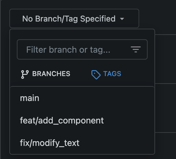
Improve branch select list ui in go templates ( #29729 )
...
Relate:[#27417 ](https://github.com/go-gitea/gitea/issues/27471 )
Reference: [#26631 ](https://github.com/go-gitea/gitea/pull/26631 )
Before

After

---------
Co-authored-by: silverwind <me@silverwind.io>
2024-03-15 11:43:10 +08:00
94512ee062
Fix Citation modal responsiveness and clipboard copy ( #29799 )
...
The modal was broken in two ways:

- On small screens, the input box was partially hanging outside the
modal. Fixed with flexbox and increased modal width.
- The clipboard copy was not working because the modal had both
`data-clipboard-text` and `data-clipboard-target`, while we only support
one of those. Made a small tweak in clipboard as well so that it will
still fall back to target if text is empty.
2024-03-15 02:38:13 +00:00
256a1eeb9a
Add `<overflow-menu>`, rename webcomponents ( #29400 )
...
1. Add `<overflow-menu>` web component
2. Rename `<gitea-origin-url>` to `<origin-url>` and make filenames
match.
<img width="439" alt="image"
src="https://github.com/go-gitea/gitea/assets/115237/2fbe4ca4-110b-4ad2-8e17-c1e116ccbd74 ">
<img width="444" alt="Screenshot 2024-03-02 at 21 36 52"
src="https://github.com/go-gitea/gitea/assets/115237/aa8f786e-dc8c-4030-b12d-7cfb74bdfd6e ">
<img width="537" alt="Screenshot 2024-03-03 at 03 05 06"
src="https://github.com/go-gitea/gitea/assets/115237/fddd50aa-adf1-4b4b-bd7f-caf30c7b2245 ">


TODO:
- [x] Check if removal of `requestAnimationFrame` is possible to avoid
flash of content. Likely needs a `MutationObserver`.
- [x] Hide tippy when button is removed from DOM.
- [x] ~~Implement right-aligned items
(https://github.com/go-gitea/gitea/pull/28976 )~~. Not going to do it.
- [x] Clean up CSS so base element has no background and add background
via tailwind instead.
- [x] Use it for org and user page.
---------
Co-authored-by: Giteabot <teabot@gitea.io>
Co-authored-by: wxiaoguang <wxiaoguang@gmail.com>
2024-03-15 02:05:31 +00:00
ce085b26fc
Improve commit record's ui in comment list ( #26619 )
...
Before:


After:


---------
Co-authored-by: silverwind <me@silverwind.io>
2024-03-14 19:01:16 +00:00
36de5b299b
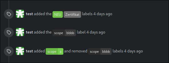
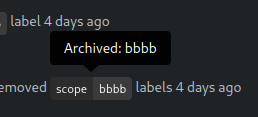
Highlight archived labels ( #29680 )
...
the issue is, that you can not distinguish between normal and archived
labels.
So this will make archived labels 80% **grayscale**. And prepend
"Archived: " to the tooltip info


---
*Sponsored by Kithara Software GmbH*
---------
Co-authored-by: delvh <dev.lh@web.de>
2024-03-12 17:32:05 +00:00
851bd18234
Improve CSV rendering ( #29638 )
...
Before:
<img width="1332" alt="Screenshot 2024-03-06 at 21 42 17"
src="https://github.com/go-gitea/gitea/assets/115237/0ea07eee-31f8-4783-bd56-37bd8396f00d ">
After:
<img width="1336" alt="Screenshot 2024-03-06 at 21 41 58"
src="https://github.com/go-gitea/gitea/assets/115237/eb7f9cc9-587f-4e3b-92bd-cc67ca639963 ">
2024-03-10 20:28:59 +01:00
ade6241691
Use flex wrap to layout the PR update button ( #29590 )
...
Follow #29418

I think using "flex-wrap: wrap" here is better than hard-coding the screen width.

By using "flex-wrap: wrap", the UI layouts automatically for various
widths (even if in some languages, the sentence might be pretty long)
2024-03-05 03:03:14 +00:00
c660149a70
Do not exceed display for the PR page buttons on smaller screens ( #29418 )
...
Fixes #29189 .
This is the result after the fix at a width of 768 pixels.

2024-03-04 14:41:53 +00:00
39f8ab591c
Clean up diff header css and reduce global textarea min-height ( #29232 )
...
1. Tweak diff header and remove a numbe of unneeded CSS for it:
Before:
<img width="433" alt="Screenshot 2024-02-18 at 01 08 09"
src="https://github.com/go-gitea/gitea/assets/115237/d8b377c0-57bc-44d5-bb57-a582c7d4b3b4 ">
After:
<img width="463" alt="Screenshot 2024-02-18 at 01 07 56"
src="https://github.com/go-gitea/gitea/assets/115237/d08c17e7-5b86-4d07-81da-6371f4754325 ">
3. Reduce height of review textarea and also reduce fomantic's CSS from
12em to 8em. Now fits better on my screen:
<img width="1352" alt="image"
src="https://github.com/go-gitea/gitea/assets/115237/5c658d13-295e-4929-94da-13ade888020d ">
---------
Co-authored-by: delvh <dev.lh@web.de>
2024-02-18 14:51:21 +00:00
9063fa0963
Remove obsolete border-radius on comment content ( #29128 )
...
This border-radius is obsolete since we changed the comment rendering a
few months ago and it caused incorrect display on blockquotes.
Before:
<img width="160" alt="Screenshot 2024-02-10 at 18 42 48"
src="https://github.com/go-gitea/gitea/assets/115237/ccbf4660-acf9-4268-aad9-1ad49d317a67 ">
After:
<img width="135" alt="Screenshot 2024-02-10 at 18 42 40"
src="https://github.com/go-gitea/gitea/assets/115237/6f588e02-3b2a-49ee-b459-81d8068b2f4e ">
2024-02-10 20:18:46 +02:00
c3e462921e
Improve user search display name ( #29002 )
...
I tripped over this strange method and I don't think we need that
workaround to fix the value.
old:

new:

---------
Co-authored-by: silverwind <me@silverwind.io>
Co-authored-by: wxiaoguang <wxiaoguang@gmail.com>
2024-02-01 17:10:16 +00:00
885cc32b14
Show latest commit for file ( #28067 )
...
If you view a file, you can now see the latest commit that changed that file.

---------
Co-authored-by: Denys Konovalov <kontakt@denyskon.de>
2024-01-15 17:42:15 +01:00
7d62615513
Revamp repo header ( #27760 )
...
Redesign repo header with following new aspects:
- responsive & better-looking repo title
- hide repo button text instead of icons in mobile view
- use same tab style as on explore and org page
<details>
<summary>Before:</summary>


</details>
<details>
<summary>After:</summary>


2024-01-12 03:44:06 +00:00
e522e774ca
Add merge arrow direction and update styling ( #28523 )
...
Close https://github.com/go-gitea/gitea/issues/28522
~Adds some [negative
margin](https://tailwindcss.com/docs/margin#using-negative-values )
helper css classes using tailwind's [prefix
syntax](https://tailwindcss.com/docs/configuration#prefix )~
### Before

### After

2024-01-05 17:38:56 +00:00
e31c6cfe6e
Fix Show/hide filetree button on small displays ( #27881 )
...
the gt-df's display:flex !important did override the display:none on small displays

---------

Co-authored-by: wxiaoguang <wxiaoguang@gmail.com>
2023-11-17 18:35:51 +00:00
49dddd87b1
Improve PR diff view on mobile ( #27883 )
...
1. Show diff stats only on large screens
these are already shown in tabs, so no need for this duplicate
information on small screens


2. Hide viewed files information on small screens
Github does the same and this gives us more free space on small screens


3. Review bar now doesn't wrap so we don't need the 77px even on very
small screens
(the sticky headers are still working)

2023-11-16 11:58:53 +08:00
4a0103fa29
Add word-break to repo description in home page ( #27924 )
...
In #25315 , @denyskon fixed UI on mobile view.
But for the repo description, on desktop view there's no word-break.
So maybe we can just add `gt-word-break` to fix it on both mobile view
and desktop view.
Before:
desktop view:

mobile view:

After:
desktop view:

mobile view(almost same?)

---------
Co-authored-by: silverwind <me@silverwind.io>
2023-11-07 23:52:08 +00:00
10a6ebb3fd
Fix the overflow style for "Hide all checks" ( #27932 )
...
Fix #27928

---------

Co-authored-by: silverwind <me@silverwind.io>
2023-11-07 18:53:35 +00:00
dcb648ee71
Add `Hide/Show all checks` button to commit status check ( #26284 )
...
Step one for a GitHub like commit status check ui:


Step two:


The design now will list all commit status checks which takes too much
space.
This is a pre-improve for #26247
---------
Co-authored-by: delvh <dev.lh@web.de>
Co-authored-by: silverwind <me@silverwind.io>
Co-authored-by: wxiaoguang <wxiaoguang@gmail.com>
2023-11-02 14:49:02 +00:00
05aa91e6da
Add dedicated class for empty placeholders ( #27788 )
...
Fixes: https://github.com/go-gitea/gitea/issues/27784
<img width="1033" alt="Screenshot 2023-10-25 at 19 07 15"
src="https://github.com/go-gitea/gitea/assets/115237/1a363851-1a86-48cb-99ec-0a573371bb6e ">
<img width="1051" alt="Screenshot 2023-10-25 at 19 07 41"
src="https://github.com/go-gitea/gitea/assets/115237/add4b606-2264-430a-af35-249ef005817f ">
Co-authored-by: KN4CK3R <admin@oldschoolhack.me>
2023-10-25 23:42:14 +02:00
f39256f035
Add word-break to organization name and description ( #26624 )
...
Fix #24318
Before:


After:


2023-10-25 10:40:39 +00:00
fba4ee7efc
Add gap between diff boxes ( #27776 )
...
Before (almost no gap between files):
<img width="1240" alt="Screenshot 2023-10-24 at 19 43 32"
src="https://github.com/go-gitea/gitea/assets/115237/30cdbdbc-d102-479c-89ce-3f68837ae0cd ">
After (with 8px gap):
<img width="1241" alt="Screenshot 2023-10-24 at 19 43 22"
src="https://github.com/go-gitea/gitea/assets/115237/72b26a30-8730-4a36-8de9-be143b684b98 ">
2023-10-25 00:47:17 +02:00
510d07506e
[FIX] resolve confusing colors in languages stats by insert a gap ( #27704 )
...
The current language stats are too obsessed with color matching. Similar
colors are always next to each other. It is a bit troublesome to find
the place where the color matching is generated, so just follow the
example of github and add a gap.
## before
<img width="883" alt="image"
src="https://github.com/go-gitea/gitea/assets/12915306/cf54430c-616c-4b37-b561-5a37c20b2d94 ">
## after
<img width="877" alt="image"
src="https://github.com/go-gitea/gitea/assets/12915306/e518ea36-2b8f-4f11-a867-a58dc393db85 ">
2023-10-20 17:33:05 +00:00
4539a7b0b4
Fix sticky diff header background ( #27697 )
...
Fixes: https://github.com/go-gitea/gitea/issues/27604
Add negative margins so the header covers any shadow of active elements.
No rendering change of the content of the header because the padding
counteracts the effect.
<img width="128" alt="image"
src="https://github.com/go-gitea/gitea/assets/115237/3d0f55b6-9351-4985-a290-da9a92d15b4e ">
2023-10-20 14:56:19 +00:00
ac4ae35542
Remove max-width and add hide text overflow ( #27359 )
...
Closes https://github.com/go-gitea/gitea/issues/27358
2023-10-09 19:04:31 -04:00
33de64cb21
link to file from its history ( #27354 )
...
Fixes #3852
Fixes https://github.com/go-gitea/gitea/issues/26707

Add a button on file history which directs you to the file at the
selected commit.

Co-authored-by: silverwind <me@silverwind.io>
2023-10-02 04:04:32 +00:00
50070550a8
Hide archived labels when filtering by labels on the issue list ( #27115 )
...
Followup https://github.com/go-gitea/gitea/pull/26820
## Archived labels UI for issue filter and issue filter actions for
issues/pull request pages.
Changed:
* Enhanced the Issue filter and Issue filter actions UI page to
seamlessly incorporate a list of archived labels.
* Pagination functionality is same as before. If archived label checkbox
is checked then we are adding a query string`archived=true` in the url
to save the state of page.
* Issue filter actions menu is separated into different template.
* Adding the archived flag in issue url labels.
* Pull Request page is also work the same.
Outsourced:
* Defer the implementation of specialized handling for archived labels
to upcoming pull requests. This step will be undertaken subsequent to
the successful merge of this pull request.
Screenshots
### Issue page
<img width="1360" alt="image"
src="https://github.com/go-gitea/gitea/assets/80308335/d7efb2ef-5b2b-449d-83f0-d430a32ec432 ">
### Issue page with label filter on archived label checkbox when not
checked --> No archived label is there in list
<img width="1249" alt="image"
src="https://github.com/go-gitea/gitea/assets/80308335/ceea68ef-91f2-4693-910f-2e25e236bfc9 ">
### Issue page with label filter on archived label checkbox when checked
--> Show archived label in the list.
<img width="710" alt="image"
src="https://github.com/go-gitea/gitea/assets/80308335/2414d26b-2079-4c3c-bd9e-f2f5411bcabf ">
### Issue page with label filter on issue action menu on archived label
checkbox when checked --> Show archived label in the list.
<img width="409" alt="image"
src="https://github.com/go-gitea/gitea/assets/80308335/259cac87-3e21-4778-99a2-a6a0b8c81178 ">
### Applied the archived=true in Issue labels when archived checkbox is
checked.
<img width="984" alt="image"
src="https://github.com/go-gitea/gitea/assets/80308335/657ce3db-c0ae-402e-b12d-3b580d3c2ed0 ">
---
Part of https://github.com/go-gitea/gitea/issues/25237
---------
Signed-off-by: puni9869 <punitinani1@hotmail.com>
Co-authored-by: delvh <dev.lh@web.de>
Co-authored-by: Giteabot <teabot@gitea.io>
2023-10-01 09:04:39 -04:00
1f00bc44b2
Fix review UI ( #27322 )
...
Close #26730
1. The `diff-detail-box` was abused, it shouldn't be used for
"DiffFileList/DiffFileTree".
2. Fix the sticky position for various screens.


2023-09-28 10:00:26 +00:00
72c68177ab
Improve issue history dialog and make poster can delete their own history ( #27323 )
...
Fix #27313 (see the comment)
And some UI improvements:
### Before


### After


2023-09-28 08:43:20 +00:00
c2cabe7b28
Fix repo sub menu ( #27169 )
...
Fix #27166
2023-09-21 21:16:14 +08:00
739e47cd80
Improve repo/user/org search ( #27030 )
...
* Fix a regression from #26809 (the `data-org` is missing)
* Remove unnecessary style
Screenshots:


2023-09-12 16:44:48 +00:00
dd6e8ab57b
Improve "language stats" UI ( #26968 )
...
Before:
* The layout is quite complex
* The UI flickers when switch the stats (https://try.gitea.io/ )
After:
* Simplify the code
* The UI doesn't flicker
2023-09-10 18:27:23 +08:00
2715ef6558
Fix scoped label layout ( #26932 )
...
Fix #26931
2023-09-06 12:22:38 +00:00
682552378f
More fixes for the "commit-body" ( #26898 )
...
The changes for "commit-body" in #26877 are not ideal.

The reason is: the "commit-body" is usually a `<pre>`, it has default
margins. In most cases, we do not need that large margin. So, this PR
introduces a general but small margin for all "commit-body" elements.
Then these `gt-m-0` could be removed.

The `:not` selector is not needed, because the `.timeline-item` selector
is already clear enough.
2023-09-04 13:38:59 +00:00
51cfe0e7de
Remove CSS `has` selector and improve various styles ( #26891 )
...
Replace #26850
Major changes:
1. Remove all `has` selectors, it is still not supported by firefox.
Actually there could be some more general and clearer approaches
2. Remove `two-toggle-buttons`, the `.ui.buttons` just works well
3. Rewrite the `.ui.buttons` border styles, see the screenshots
4. Remove the "fine-tuning" paddings from the the flex children, they
could layout themselves well.


2023-09-04 18:22:46 +08:00
fba7150ca9
Refactor "shortsha" ( #26877 )
...
The old code used complex `if` blocks and strange HTML layouts.
<details>

</details>
This PR refactors the template code and remove legacy CSS styles. The UI
doesn't change much.


2023-09-03 02:58:52 +00:00
3d109861dd
Render code blocks in repo description ( #26830 )
...
Backtick syntax now works in repo description too. Also, I replaced the
CSS for this was a new single class, making it more flexible and not
dependent on a parent. Also, very slightly reduced font size from 16.8px
to 16px.

---------

Co-authored-by: wxiaoguang <wxiaoguang@gmail.com>
2023-08-31 05:01:01 +00:00
1bb9b1c4d9
Remove polluted ".ui.left" style ( #26809 )
2023-08-30 21:46:24 +08:00
dca2f9371d
Unify `border-radius` behavior ( #26770 )
...
## Changes
- no more hardcoded `border-radius`es (apart from `0`)
- no more value inconsistencies
- no more guessing what pixel value you should use
- two new variables:
- `--border-radius-medium` (for elements where the normal border radius
does not suffice)
  - `--border-radius-circle` (for displaying circles)

---------

Co-authored-by: silverwind <me@silverwind.io>
2023-08-28 19:43:59 +00:00
7b05d66e60
Fixed text overflow in dropdown menu ( #26694 )
...
Fixes #26622

Co-authored-by: Giteabot <teabot@gitea.io>
2023-08-25 11:15:21 +00:00
390ec619f3
Fix review bar misalignment ( #26711 )
2023-08-24 23:46:30 +08:00
42cbe6005a
Improve the branch selector tab UI ( #26631 )
2023-08-21 13:35:02 +00:00
fe2b9274b1
Fix various line-height styles ( #26553 )
...
Fix #26537
Use the same default line-height as "normalize.css" instead of "1". "1"
is not right because it doesn't work with descent part and causes
overflow problems.

---------
Co-authored-by: silverwind <me@silverwind.io>
2023-08-17 21:50:32 +00:00
ab78c39e41
Refactor project templates ( #26448 )
...
This PR refactors a bunch of projects-related code, mostly the
templates.
The following things were done:
- rename boards to columns in frontend code
- use the new `ctx.Locale.Tr` method
- cleanup template, remove useless newlines, classes, comments
- merge org-/user and repo level project template together
- move "new column" button into project toolbar
- move issue card (shared by projects and pinned issues) to shared
template, remove useless duplicated styles
- add search function to projects (to make the layout more similar to
milestones list where it is inherited from 😆 )
- maybe more changes I forgot I've done 😆
Closes #24893
After:


---------
Co-authored-by: silverwind <me@silverwind.io>
2023-08-12 10:30:28 +00:00
6ed4626ed5
Merge `templates/projects/list.tmpl` and `templates/repo/projects/list.tmpl` together ( #26265 )
...
(cherry picked from commit 473862a1d599382ca022482e2e044025872d240b)

Refs: https://codeberg.org/forgejo/forgejo/pulls/1126

Co-authored-by: Louis Seubert <louis.seubert.ls@gmail.com>
Co-authored-by: Giteabot <teabot@gitea.io>
2023-08-01 16:54:54 +00:00
b9baed2c74
Introduce `flex-list` & `flex-item` elements for Gitea UI ( #25790 )
...
This PR introduces a new UI element type for Gitea called `flex-item`.
It consists of a horizontal card with a leading, main and trailing part:

The idea behind it is that in Gitea UI, we have many cases where we use
this kind of layout, but it is achieved in many different ways:
- grid layout
- `.ui.list` with additional hacky flexbox
- `.ui.key.list` - looks to me like a style set originally created for
ssh/gpg key list, was used in many other places
- `.issue.list` - created for issue cards, used in many other places
- ...
This new style is based on `.issue.list`, specifically the refactoring
of it done in #25750 .
In this PR, the new element is introduced and lots of templates are
being refactored to use that style. This allows to remove a lot of
page-specific css, makes many of the elements responsive or simply
provides a cleaner/better-looking way to present information.
A devtest section with the new style is also available.
<details>
<summary>Screenshots (left: before, right: after)</summary>


</details>
---------
Co-authored-by: Giteabot <teabot@gitea.io>
2023-08-01 00:13:42 +02:00
1d8d90fd37
Fixing the align of commit stats in commit_page template. ( #26161 )
...
Fixing the align center to row and space around for commit_page
template.
2023-07-28 13:12:44 -04:00
2f0e79e639
Use frontend fetch for branch dropdown component ( #25719 )
...
- Send request to get branch/tag list, use loading icon when waiting for
response.
- Only fetch when the first time branch/tag list shows.
- For backend, removed assignment to `ctx.Data["Branches"]` and
`ctx.Data["Tags"]` from `context/repo.go` and passed these data wherever
needed.
- Changed some `v-if` to `v-show` and used native `svg` as mentioned in
https://github.com/go-gitea/gitea/pull/25719#issuecomment-1631712757 to
improve perfomance when there are a lot of branches.
- Places Used the dropdown component:
Repo Home Page
<img width="1429" alt="Screen Shot 2023-07-06 at 12 17 51"
src="https://github.com/go-gitea/gitea/assets/17645053/6accc7b6-8d37-4e88-ae1a-bd2b3b927ea0 ">
Commits Page
<img width="1431" alt="Screen Shot 2023-07-06 at 12 18 34"
src="https://github.com/go-gitea/gitea/assets/17645053/2d0bf306-d1e2-45a8-a784-bc424879f537 ">
Specific commit -> operations -> cherry-pick
<img width="758" alt="Screen Shot 2023-07-06 at 12 23 28"
src="https://github.com/go-gitea/gitea/assets/17645053/1e557948-3881-4e45-a625-8ef36d45ae2d ">
Release Page
<img width="1433" alt="Screen Shot 2023-07-06 at 12 25 05"
src="https://github.com/go-gitea/gitea/assets/17645053/3ec82af1-15a4-4162-a50b-04a9502161bb ">
- Demo
https://github.com/go-gitea/gitea/assets/17645053/d45d266b-3eb0-465a-82f9-57f78dc5f9f3
- Note:
UI of dropdown menu could be improved in another PR as it should apply
to more dropdown menus.
Fix #14180
---------
Co-authored-by: silverwind <me@silverwind.io>
Co-authored-by: wxiaoguang <wxiaoguang@gmail.com>
2023-07-21 11:20:04 +00:00
b81c013057
Don't stack PR tab menu on small screens ( #25789 )
...
the stacking takes up screen space - display the tabs as the navigation
bar. github uses the same layout.
Screenshots (left before, right after):


Large screen:

2023-07-14 01:54:20 +00:00
eec45b43db
move issue filters to shared template ( #25729 )
...
Issue filters are being used on repo list page and on milestone issues
page, and the code is mostly duplicated.

This PR does the following changes:
- move issue filters into a shared template
- allow filtering milestone issues by project, so no need to hide this
filter on milestone issues page
- remove some dead code (e. g. issue actions in milestone issues
template)
- fix label filter dropdown width

---------

Co-authored-by: 6543 <6543@obermui.de>
2023-07-13 20:00:38 +00:00