1e3c4d8fc7
Improve mobile review ui ( #31091 )
...
Fixes: https://github.com/go-gitea/gitea/issues/31071
Not perfect but much better than before.
Before: Overflows, sticky not working, filename unreadable:
<img width="506" alt="Screenshot 2024-05-27 at 02 02 40"
src="https://github.com/go-gitea/gitea/assets/115237/a06b1edf-dece-4402-98c2-68670fca265f ">
After:
<img width="457" alt="Screenshot 2024-05-27 at 01 59 06"
src="https://github.com/go-gitea/gitea/assets/115237/2a282c96-e719-4554-b418-81963ae6269c ">
2024-05-28 13:41:37 +00:00
3c2406a2f3
Use CSS `inset` shorthand ( #30939 )
...
Use [inset](https://developer.mozilla.org/en-US/docs/Web/CSS/inset )
shorthand instead of longhands. There may be more cases but these ones I
was able to definitely identify.
2024-05-11 14:28:56 +00:00
662eb4b085
Markup color and font size fixes ( #30282 )
...
1. Distinguish inline an block code with new CSS variable
`--color-markup-code-inline`
2. Various color tweaks, better contrast from background
<img width="447" alt="Screenshot 2024-04-05 at 00 51 00"
src="https://github.com/go-gitea/gitea/assets/115237/93e069f4-6807-4f2c-9331-2d69730919d4 ">
<img width="456" alt="Screenshot 2024-04-05 at 00 50 44"
src="https://github.com/go-gitea/gitea/assets/115237/0dc9c745-c531-40fa-94ec-b0ba10bd7ccf ">
2024-04-06 23:06:27 +02:00
7396172a02
Fix code block style for code preview ( #30298 )
...
Fix #30292

To avoid unnecessary style overriding, use "div" instead of "code"
2024-04-06 20:07:08 +08:00
6f4e2e79ff
Show 12 lines in markup code preview ( #30255 )
...
Show up to 12 lines instead of previous 5.
2024-04-02 21:44:15 -04:00
ca5c895efb
Render embedded code preview by permlink in markdown ( #30234 )
...
The permlink in markdown will be rendered as a code preview block, like GitHub

Co-authored-by: silverwind <me@silverwind.io>
2024-04-02 17:48:27 +00:00
5f5b5ba6e3
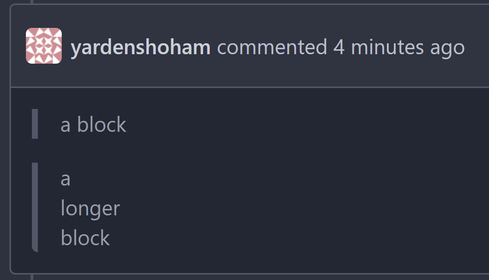
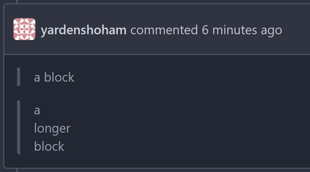
Make blockquote border size less aggressive ( #29124 )
...
It's too thick
I made it match GitHub's size
# Before

# After

Signed-off-by: Yarden Shoham <git@yardenshoham.com>
2024-02-10 14:55:46 +02:00
4cb51cb985
Absolute positioned checkboxes overlay floated elements ( #26870 )
...
Currently, checkboxes are positioned as absolute. This positioning
causes the input to overlay an element that has been floated within the
editor. Floated elements are useful if you want your text to wrap around
this element. This PR fixes the overlaying of checkboxes by removing the
absolute positioning, updating the `ul` padding, and
displaying`.task-list-item` `flex` to ensure inputs and the associated
label are on the same line.
Screenshots:
Before:
<img width="762" alt="Screenshot 2023-09-01 at 3 40 59 PM"
src="https://github.com/go-gitea/gitea/assets/6152817/570247c7-7f5c-4697-bfc9-ad4655e37991 ">
After:
<img width="762" alt="Screenshot 2023-09-01 at 3 42 20 PM"
src="https://github.com/go-gitea/gitea/assets/6152817/db53df45-1294-4eee-84c0-b21ac4fdf805 ">
---------
Co-authored-by: rafh <rafaelheard@gmail.com>
2023-09-30 09:30:44 +00:00
dca2f9371d
Unify `border-radius` behavior ( #26770 )
...
## Changes
- no more hardcoded `border-radius`es (apart from `0`)
- no more value inconsistencies
- no more guessing what pixel value you should use
- two new variables:
- `--border-radius-medium` (for elements where the normal border radius
does not suffice)
  - `--border-radius-circle` (for displaying circles)

---------

Co-authored-by: silverwind <me@silverwind.io>
2023-08-28 19:43:59 +00:00
eaea530d6b
Render plaintext task list items for markdown files ( #26186 )
...
- The library that's being used for org-mode, [doesn't render the status
of list items](https://github.com/niklasfasching/go-org/issues/63 ).
- Add a modified version of the proposed CSS snippet to still display
the status for the list items. The alternative was parsing HTML and
transforming it, which is too complicated for this small task.
- Resolves https://codeberg.org/Codeberg/Community/issues/1099
(cherry picked from commit 9753c7e4b8490b8f1e3d19cb06187503b88afb88)
Refs: https://codeberg.org/forgejo/forgejo/pulls/1071
Co-authored-by: Gusted <postmaster@gusted.xyz>
2023-07-27 14:15:31 +00:00
a5e09a5595
Fix UI regression of asciinema player ( #26159 )
...
It was caused by updating `asciinema-player`, the upstream changed the
CSS class prefix:
`40505e479ehttps://github.com/go-gitea/gitea/assets/9418365/b91a2cf5-c1da-43d6-bac2-bc278728b11e ">
</details>
<details>
<summary>After:</summary>
<img width="1311" alt="image"
src="https://github.com/go-gitea/gitea/assets/9418365/c9872d25-e0bb-43d4-8b1e-d87c6b03c0a2 ">
</details>
2023-07-26 09:46:59 +00:00
62ab55bacc
Improve wiki sidebar and TOC ( #25460 )
...
Close #20976
Close #20975

1. Fix the bug: the TOC in footer was incorrectly rendered as main
content's TOC
2. Fix the layout: on mobile, the TOC is put above the main content,
while the sidebar is put below the main content
3. Auto collapse the TOC on mobile

ps: many styles of "wiki.css" are moved from old css files, so leave
nits to following PRs.
2023-06-23 15:51:43 -04:00
61e0827f42
Add `stylelint-declaration-block-no-ignored-properties` ( #25284 )
...
Add
[stylelint-declaration-block-no-ignored-properties](https://github.com/kristerkari/stylelint-declaration-block-no-ignored-properties )
and fix discovered issue. There is no visual difference in these markup
code blocks.
2023-06-18 04:22:09 +00:00
19993d8814
Change `--font-weight-bold` to `--font-weight-semibold` and 600 value, introduce new font weight variables ( #24827 )
...
There was some recent discussion about this in Discord `ui-design`
channel and the conclusion was that
https://github.com/go-gitea/gitea/issues/24305 should have fixed their
OS font installation to have semibold weights.

I have now tested this 601 weight on a Windows 10 machine on Firefox
myself, and I immediately noticed that bold was excessivly bold and
rendering as 700 because browsers are biased towards bolder fonts. So
revert this back to the previous value.
2023-05-21 23:37:32 +00:00
268d121f4b
Fix video width overflow in markdown, and other changes to match img ( #24834 )
...
This change makes the CSS for `<video>` in markup match that of `<img>`,
and also allows additional attributes to be used. This way the width,
padding, alignment should work equally well for both.
2023-05-21 21:19:37 +00:00
32d9c47ec7
Add RTL rendering support to Markdown ( #24816 )
...
Support RTL content in Markdown:

Example document:
https://try.gitea.io/silverwind/symlink-test/src/branch/master/bidi-text.md
Same on GitHub:
https://github.com/silverwind/symlink-test/blob/master/bidi-text.md
`dir=auto` enables a browser heuristic that sets the text direction
automatically. It is the only way to get automatic text direction.
Ref: https://codeberg.org/Codeberg/Community/issues/1021
---------
Co-authored-by: wxiaoguang <wxiaoguang@gmail.com>
2023-05-20 23:02:52 +02:00
20a3b03fe5
Add --font-weight-bold and set previous bold to 601 ( #24307 )
...
Fix #24305

According to MDN, "bold" starts from 700, some fonts do not provide
"bolding" for weight 600

https://developer.mozilla.org/en-US/docs/Web/CSS/font-weight

---------

Co-authored-by: silverwind <me@silverwind.io>
Co-authored-by: Giteabot <teabot@gitea.io>
2023-04-24 13:46:00 -04:00
dcde4701a5
Fix math and mermaid rendering bugs ( #24049 )
...
1. Fix multiple error display for math and mermaid:

2. Fix height calculation of certain mermaid diagrams by reading the
iframe inner height from it's document instead of parsing it from SVG:
Before:
<img width="866" alt="Screenshot 2023-04-11 at 11 56 27"
src="https://user-images.githubusercontent.com/115237/231126480-b194e02b-ea8c-4ddf-8c79-50c525815d92.png ">
After:
<img width="855" alt="Screenshot 2023-04-11 at 11 56 35"
src="https://user-images.githubusercontent.com/115237/231126494-5fe86a48-8d21-455a-8b95-79b6ee27a16f.png ">
3. Refactor error handling to a common function
4. Rename to `renderAsciicast` for consistency
5. Improve mermaid loading sequence
Note: I did try `securityLevel: 'sandbox'` to make mermaid output a
iframe directly, but that showed a bug in mermaid where the iframe style
height was set incorrectly. Opened
https://github.com/mermaid-js/mermaid/issues/4289 for this.
---------
Co-authored-by: Giteabot <teabot@gitea.io>
2023-04-17 12:10:22 +02:00
f2b98d8259
Show errors for KaTeX and mermaid on the preview tab ( #24009 )
...
There is a conflicting fomantic rule that hid the error messages inside
the markdown preview tab for things like mermaid or katex.
Overruled it to always show these errors.
<img width="774" alt="image"
src="https://user-images.githubusercontent.com/115237/230738528-322814c1-8994-495e-b901-bbb79b924ccb.png ">
2023-04-09 08:07:43 -04:00
c0246677a6
Fix markup background, improve wiki rendering ( #23750 )
...
Fix regression from https://github.com/go-gitea/gitea/pull/23578 . Only
visible on arc-green.
Before:
<img width="997" alt="Screenshot 2023-03-27 at 19 14 21"
src="https://user-images.githubusercontent.com/115237/228016589-e7cabfb9-bfd0-45fd-9407-6b76c665ed1a.png ">
After:
<img width="1000" alt="Screenshot 2023-03-27 at 19 14 05"
src="https://user-images.githubusercontent.com/115237/228016600-db2e6002-4e2c-4d18-8393-9d7e1f525acb.png ">
Fixes: https://github.com/go-gitea/gitea/issues/20625
Fixes: https://github.com/go-gitea/gitea/issues/23718
2023-04-07 17:30:04 -04:00
ca0ce9feb0
Set opaque background on markup and images ( #23578 )
...
- Set opaque background on markup images so they can visually break
`<hr>`
- Change padding of comment box so `padding` is provided by the
`.markup` element instead of its parent, matching the file rendering
view which does the same.
Before:
<img width="243" alt="Screenshot 2023-03-19 at 19 22 03"
src="https://user-images.githubusercontent.com/115237/226198663-8ff4d940-6a15-452d-ac58-14485b37fbc7.png ">
After:
<img width="261" alt="Screenshot 2023-03-19 at 19 23 26"
src="https://user-images.githubusercontent.com/115237/226198689-1bf56561-4726-46dc-b583-423d65e1e13a.png ">
<img width="263" alt="image"
src="https://user-images.githubusercontent.com/115237/226199002-e93c817d-6d9c-4b98-bad8-0aa0bd45b62f.png ">
Example documents:
https://try.gitea.io/silverwind/symlink-test/src/branch/master/test-page.md
https://github.com/silverwind/symlink-test/blob/master/test-page.md
2023-03-21 17:38:04 -04:00
202803fc69
Replace Less with CSS ( #23481 )
...
Ran most of the Less files through the Less compiler and Prettier and
then followed up with a round of manual fixes.

The Less compiler had unfortunately stripped all `//` style comments
that I had to restore (It did preserve `/* */` comments). Other fixes
include duplicate selector removal which were revealed after the
transpilation and which weren't caught by stylelint before but now are.

Fixes: https://github.com/go-gitea/gitea/issues/15565
2023-03-14 22:20:19 -04:00