07373f1d5d
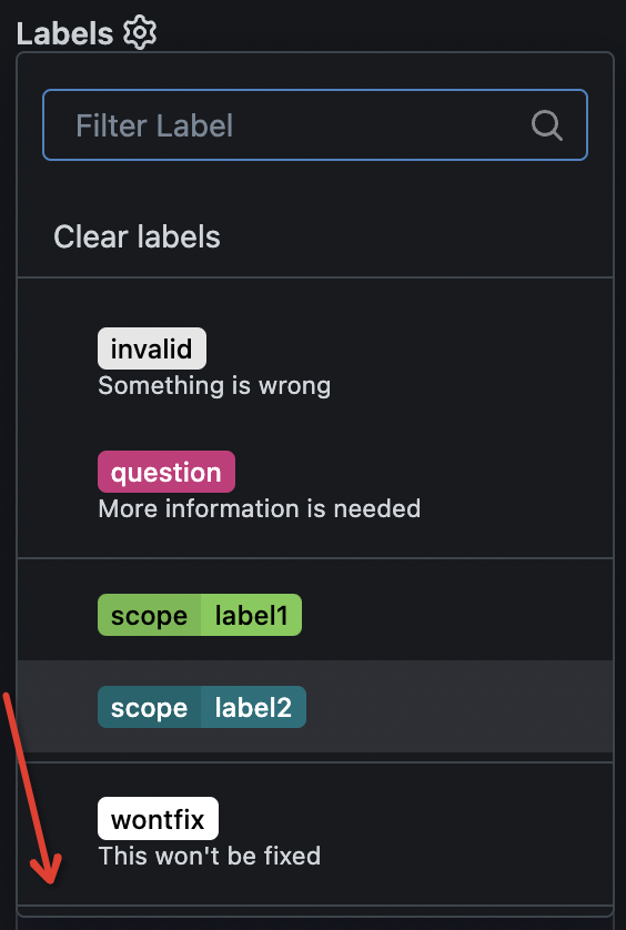
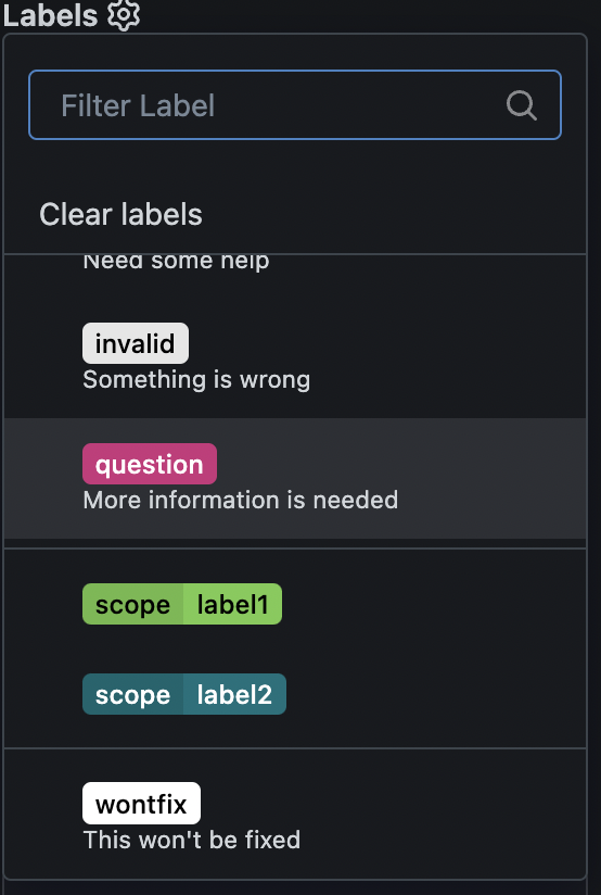
Improve issue sidebar UI ( #32587 )
...
1. remove duplicate dividers
2. align reviewer items
3. merge & remove unused CSS styles
Before:
<details>

</details>
After:
<details>

</details>
2024-11-21 03:31:54 +00:00
23d0f9083e
make search box in issue sidebar dropdown list always show when scrolling ( #32576 )
...
as title, replace #31597 after #32460

---------

Signed-off-by: a1012112796 <1012112796@qq.com>
2024-11-21 09:23:50 +08:00
e546480d0a
Fix large image overflow in comment page ( #31740 )
...
Close #31709
52px is calculate by avatar size in
templates\repo\issue\view_content\comments.tmpl
```html
<img src="{{.Poster.AvatarLink $.Context}}" width="40" height="40">
```
+
```css
.ui.comments .comment > .avatar ~ .content {
margin-left: 12px;
}
```

---------
Co-authored-by: wxiaoguang <wxiaoguang@gmail.com>
2024-11-15 18:34:54 +00:00
a928739456
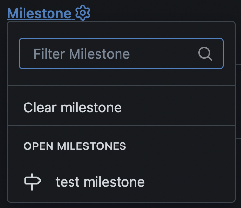
Refactor sidebar assignee&milestone&project selectors ( #32465 )
...
Follow #32460
Now the code could be much clearer than before and easier to maintain. A
lot of legacy code is removed.
Manually tested.
This PR is large enough, that fine tunes could be deferred to the future if
there is no bug found or design problem.
Screenshots:
<details>

</details>
2024-11-11 04:07:54 +08:00
58c634b854
Refactor sidebar label selector ( #32460 )
...
Introduce `issueSidebarLabelsData` to handle all sidebar labels related data.
2024-11-10 08:26:42 +00:00
18aeca5320
Add reviewers selection to new pull request ( #32403 )
...
Users could add reviewers when creating new PRs.

---------

Co-authored-by: splitt3r <splitt3r@users.noreply.github.com>
Co-authored-by: Sebastian Sauer <sauer.sebastian@gmail.com>
Co-authored-by: bb-ben <70356237+bboerben@users.noreply.github.com>
Co-authored-by: wxiaoguang <wxiaoguang@gmail.com>
2024-11-09 04:48:31 +00:00
d80f99ef04
Fix issue sidebar ( #32455 )
...
Fix #32453

Major changes:

* revert the `<div class="divider"></div>` in
`templates/repo/issue/branch_selector_field.tmpl` (it was removed by
mistake in ##32444)
* remove incorrect `<div class="inline field">` in
`templates/repo/issue/sidebar/allow_maintainer_edit.tmpl`
* use `gt-ellipsis` to replace the "title" class in the dependency list,
then `.repository .issue-content-right .ui.list .title` could be removed
* remove the "relaxed" from dependency list, then there is no padding,
then `.repository .issue-content-right .ui.list .dependency` could be
removed (`white-space` doesn't have effect either because there is
`gt-ellipsis`)
* remove dead code `.repository .issue-content-right #deadlineForm input
`

The fixed UI should be the same as before.
2024-11-09 01:55:32 +08:00
623a2d41cc
Refactor issue page info ( #32445 )
...
Fix a longstanding TODO since 2021 (#14826 ) / 2018 (#2531 )
2024-11-08 02:21:13 +00:00
028e612094
Split issue sidebar into small templates ( #32444 )
...
Only move code
2024-11-08 01:44:20 +00:00
145e266987
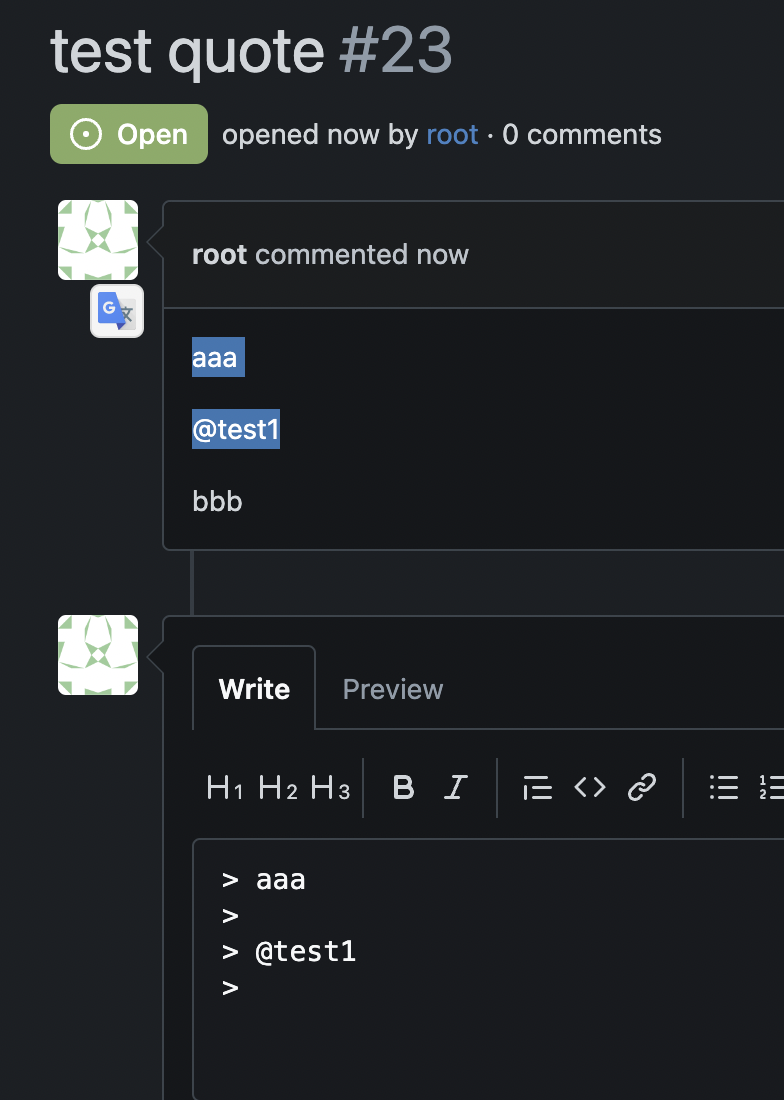
Support quote selected comments to reply ( #32431 )
...
Many existing tests were quite hacky, these could be improved later.
<details>
</details>
2024-11-07 03:57:07 +00:00
24b83ff63e
Fix milestone deadline and date related problems ( #32339 )
...
Use zero instead of 9999-12-31 for deadline
Fix #32291

---------

Co-authored-by: wxiaoguang <wxiaoguang@gmail.com>
Co-authored-by: Giteabot <teabot@gitea.io>
2024-11-05 07:46:40 +00:00
4a469c8e1b
Refactor template ctx and render utils ( #32422 )
...
Clean up the templates
2024-11-05 14:04:26 +08:00
b068dbd40e
Refactor DateUtils and merge TimeSince ( #32409 )
...
Follow #32383 and #32402
2024-11-04 11:30:00 +00:00
259811617b
Replace DateTime with proper functions ( #32402 )
...
Follow #32383

This PR cleans up the "Deadline" usages in templates, make them call
`ParseLegacy` first to get a `Time` struct then display by `DateUtils`.

Now it should be pretty clear how "deadline string" works, it makes it
possible to do further refactoring and correcting.
2024-11-02 21:04:53 +00:00
fec6b3d500
Replace DateTime with DateUtils ( #32383 )
2024-11-02 04:08:28 +00:00
1cd3f69859
remove unused call to $.HeadRepo in view_title template ( #32317 )
...
This is only populated in
[`ParseCompareInfo`](https://github.com/search?q=repo%3Ago-gitea%2Fgitea%20%20.Data%5B%22HeadRepo%22%5D&type=code )
which is called in two handlers:
*
[`CompareAndPullRequestPost`](9206fbb55f/routers/web/repo/pull.go (L1246)9206fbb55f/routers/web/repo/compare.go (L706)
2024-10-30 13:12:48 +08:00
de2ad2e1b1
Make admins adhere to branch protection rules ( #32248 )
...
This introduces a new flag `BlockAdminMergeOverride` on the branch
protection rules that prevents admins/repo owners from bypassing branch
protection rules and merging without approvals or failing status checks.

Fixes #17131

---------

Co-authored-by: wxiaoguang <wxiaoguang@gmail.com>
Co-authored-by: Giteabot <teabot@gitea.io>
2024-10-23 12:39:43 +08:00
e2f365b55c
Display head branch more comfortable on pull request view ( #32000 )
...
This PR do some minor improvements for head branch display on pull
request view UI.
- [x] Remove the link if the head branch has been deleted with a
tooltip, so that users will not result in a 404 page
- [x] Display a label if this pull request is an agit based one.

2024-09-24 04:14:57 +00:00
2c6fa6c1e0
Fix template bug of pull request view ( #32072 )
...
Caused by #31924
2024-09-24 03:02:42 +00:00
e1f0598c8f
Fix Bug in Issue/pulls list ( #32081 )
...
fix #32080
## After
### for opened issues
<img width="1199" alt="Screenshot 2024-09-19 at 6 29 31 PM"
src="https://github.com/user-attachments/assets/86cf48ad-5e4b-4dcb-8abe-4d7fd74e0aec ">
### for closed issues
<img width="1208" alt="Screenshot 2024-09-19 at 6 29 37 PM"
src="https://github.com/user-attachments/assets/a16bc545-bfcf-49a4-be52-3e7334910482 ">
### for all issues
<img width="1340" alt="Screenshot 2024-09-20 at 12 07 12 PM"
src="https://github.com/user-attachments/assets/b2309c8f-e59d-44e9-ae3b-bf54e1196169 ">
2024-09-24 01:09:57 +08:00
e9c64f41a6
Distinguish official vs non-official reviews, add tool tips, and upgr… ( #31924 )
...
This Pull Request is a follow up to
https://github.com/go-gitea/gitea/pull/31886 :
1. Adds a UI indicator between official (green) and unofficial (grey)
approved pull requests on the Pull Request page (as suggested by
@kdumontnu )
2. Adds tooltips adding clarity to the type and status of a review on
the Pull Request page (as suggested by @kdumontnu)
3. Updates text adding more clarity to required approvals (as suggested
by @kdumontnu)
4. Updates text on the branch settings page explaining what branch
approval limitations (as suggested by @yp05327)
Official approval:
<img width="376" alt="Screenshot 2024-08-26 at 1 03 52 PM"
src="https://github.com/user-attachments/assets/500f083d-bfc0-45c5-82b7-b98e20495696 ">
Unofficial approval:
<img width="442" alt="Screenshot 2024-08-26 at 12 53 15 PM"
src="https://github.com/user-attachments/assets/e8c565ff-5886-4ce1-8b79-a0fa26c282f7 ">
Rejected approval:
<img width="452" alt="Screenshot 2024-08-26 at 12 53 06 PM"
src="https://github.com/user-attachments/assets/aebc0e2f-7052-4dea-8098-7caa0db86617 ">
Stale approval:
<img width="546" alt="Screenshot 2024-08-26 at 1 07 59 PM"
src="https://github.com/user-attachments/assets/da599ff3-e35c-4fa3-8141-ed80b738dd77 ">
Requested review tooltip:
<img width="434" alt="Screenshot 2024-08-26 at 12 53 22 PM"
src="https://github.com/user-attachments/assets/460d163e-8724-43b6-8760-34b285da8fe2 ">
Updated text for approvals:
<img width="991" alt="Screenshot 2024-08-26 at 12 54 00 PM"
src="https://github.com/user-attachments/assets/ab3ff012-9742-4c1b-933d-21addcb89f2c ">
Updated text for allowlisted/whitelisted approvals:
<img width="990" alt="Screenshot 2024-08-26 at 1 01 40 PM"
src="https://github.com/user-attachments/assets/1a5bae61-d9e0-4d96-b86f-92610b0940d1 ">
Protected branch settings text:
<img width="1022" alt="Screenshot 2024-08-26 at 1 01 14 PM"
src="https://github.com/user-attachments/assets/892ce208-e1c2-41f7-8fec-46d5a0e7e776 ">
Comments list:
<img width="1048" alt="Screenshot 2024-08-28 at 9 25 31 AM"
src="https://github.com/user-attachments/assets/9c5c00c5-06cf-43b3-b413-4f7f673609b2 ">
---------
Co-authored-by: Kyle D. <kdumontnu@gmail.com>
2024-09-06 06:40:02 +00:00
8883d99184
Support issue template assignees ( #31083 )
...
Resolve #13955
2024-08-12 16:00:40 +08:00
9633f336c8
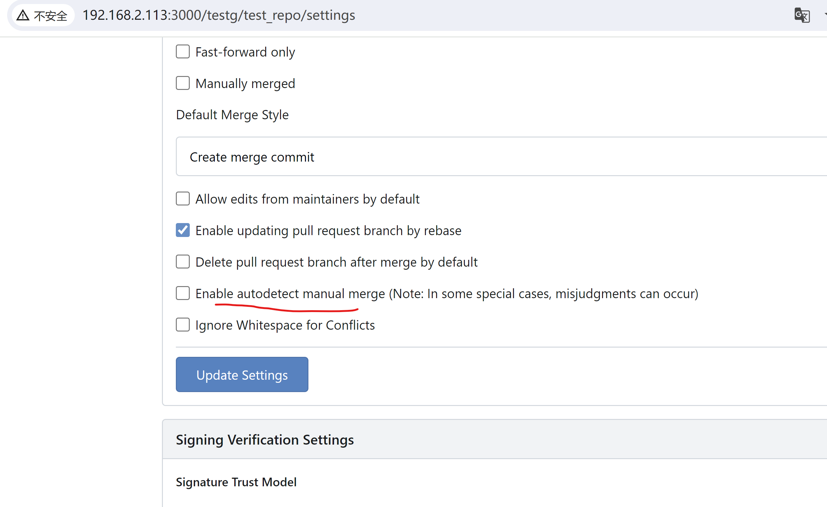
Add warning message in merge instructions when `AutodetectManualMerge` was not enabled ( #31805 )
...
not enabled
quick-f-i-x https://github.com/go-gitea/gitea/issues/31433 ? , maybe
need more disscusion about better solutions.
example view:
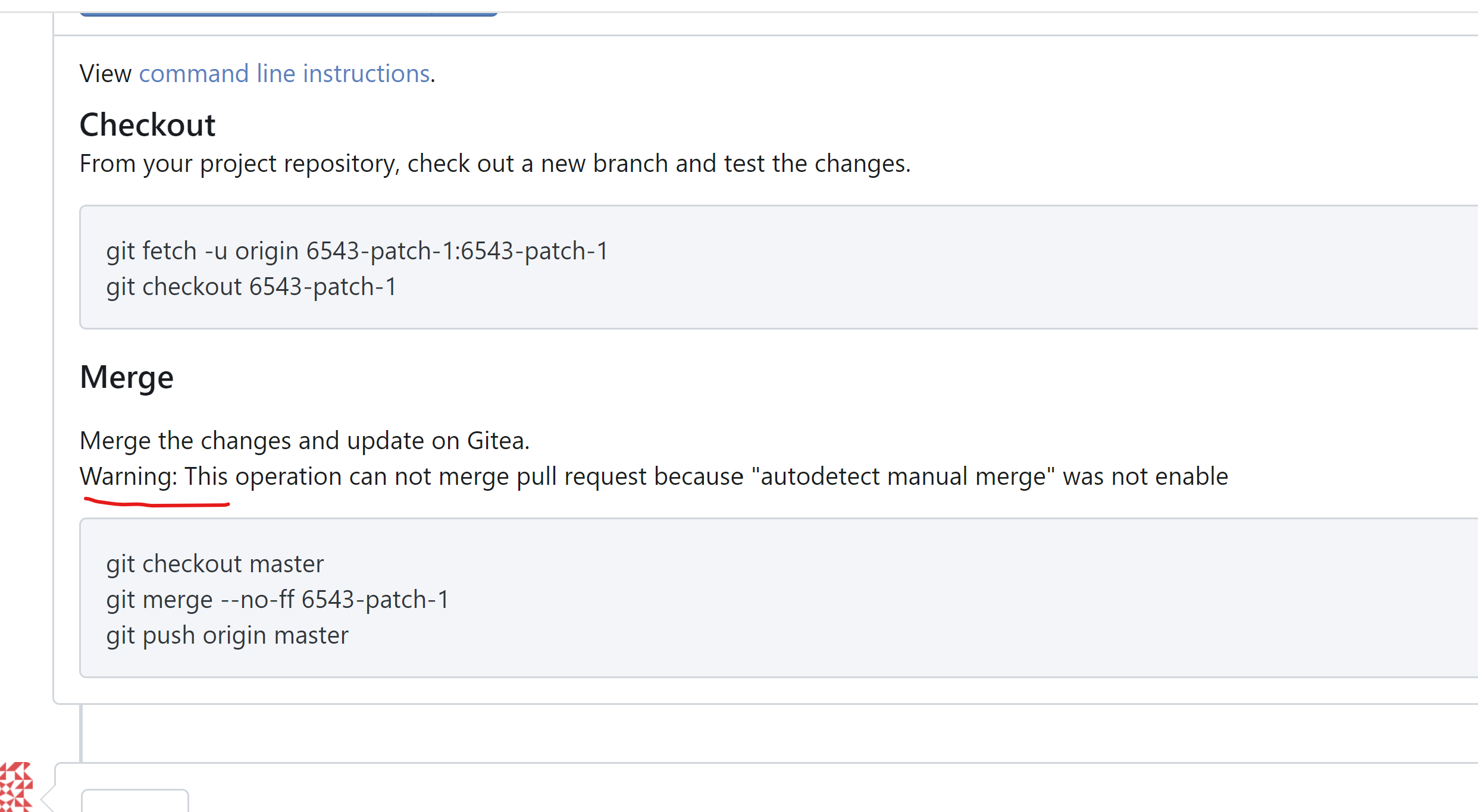
adtion notes about how to enable `AutodetectManualMerge`
Signed-off-by: a1012112796 <1012112796@qq.com>
2024-08-10 01:09:34 +00:00
791d7fc76a
Add issue comment when moving issues from one column to another of the project ( #29311 )
...
Fix #27278
Replace #27816
This PR adds a meta-comment for an issue when dragging an issue from one
column to another of a project.
<img width="600" alt="image"
src="https://github.com/go-gitea/gitea/assets/81045/5fc1d954-430e-4db0-aaee-a00006fa91f5 ">
---------
Co-authored-by: wxiaoguang <wxiaoguang@gmail.com>
Co-authored-by: yp05327 <576951401@qq.com>
2024-08-09 01:29:02 +00:00
75d0b61546
Fix the display of project type for deleted projects ( #31732 )
...
Fix : #31727
After:

2024-07-30 04:37:43 +00:00
e8d4b7a8b1
Added default sorting milestones by name ( #27084 )
...
#26996
Added default sorting for milestones by name.
Additional, name for sorting closestduedate and furthestduedate was
broken, so I fixed it.

---------

Co-authored-by: Lunny Xiao <xiaolunwen@gmail.com>
2024-07-16 10:08:54 +02:00
d7c7a78994
Don't show hidden labels when filling out an issue template ( #31576 )
...
Related to #31574


---
*Sponsored by Kithara Software GmbH*
2024-07-08 04:31:12 +00:00
0c4ff01109
Disable issue/PR comment button given empty input ( #31463 )
...
Given an empty issue/PR comment, the comment history would not be
updated if the user were to submit it. Therefore, it would make since to
just disable the comment button when the text editor is empty.

This is inline with what GitHub does when given empty text editor input.

---------

Co-authored-by: wxiaoguang <wxiaoguang@gmail.com>
2024-06-23 18:41:01 +00:00
37a4b233a0
Refactor repo unit "disabled" check ( #31389 )
...
1. There are already global "unit consts", no need to use context data, which is fragile
2. Remove the "String()" method from "unit", it would only cause rendering problems in templates

---------

Co-authored-by: silverwind <me@silverwind.io>
2024-06-18 00:51:13 +00:00
21ba5ca03b
Fix navbar `+` menu flashing on page load ( #31281 )
...
Fixes
https://github.com/go-gitea/gitea/pull/31273#issuecomment-2153771331 .
Same method as used in https://github.com/go-gitea/gitea/pull/30215 . All
left-opening dropdowns need to use it method.
---------
Co-authored-by: wxiaoguang <wxiaoguang@gmail.com>
Co-authored-by: Giteabot <teabot@gitea.io>
2024-06-12 14:58:03 +00:00
e6ab6e637f
code optimization ( #31315 )
...
Simplifying complex if-else to existing Iif operations
2024-06-11 21:07:10 +08:00
da4bbc4247
Allow including `Reviewed-on`/`Reviewed-by` lines for custom merge messages ( #31211 )
...
This PR introduces the `ReviewedOn` and `ReviewedBy` variables for the
default merge message templates (e.g.,
`.gitea/default_merge_message/MERGE_TEMPLATE.md`).
This allows customizing the default merge messages while retaining these
trailers.
This also moves the associated logic out of `pull.tmpl` into the
relevant Go function.
This is a first contribution towards #11077 .
---
For illustration, this allows to recreate the "default default" merge
message with the following template:
```
.gitea/default_merge_message/MERGE_TEMPLATE.md
Merge pull request '${PullRequestTitle}' (${PullRequestReference}) from ${HeadBranch} into ${BaseBranch}
${ReviewedOn}
${ReviewedBy}
```
2024-06-06 08:35:04 +00:00
138e946c3d
Replace `gt-word-break` with `tw-break-anywhere` ( #31183 )
...
`overflow-wrap: anywhere` is a superior alternative to `word-wrap:
break-word` and we were already setting it in the class. I tested a few
cases, all look good.
2024-06-04 13:57:11 +00:00
9b05bfb173
Fix overflow in issue card ( #31203 )
...
Before:
<img width="373" alt="Screenshot 2024-06-01 at 01 31 26"
src="https://github.com/go-gitea/gitea/assets/115237/82a210f2-c82e-4b7e-ac43-e70e46fa1186 ">
After:
<img width="376" alt="Screenshot 2024-06-01 at 01 31 32"
src="https://github.com/go-gitea/gitea/assets/115237/82d1b9f7-4fad-47bd-948a-04e1e7e006e6 ">
2024-06-03 00:09:51 +00:00
2788a7ca27
Fix agit checkout command line hint & fix ShowMergeInstructions checking ( #31219 )
2024-06-03 06:45:21 +08:00
aa92b13164
Prevent simultaneous editing of comments and issues ( #31053 )
...
fixes #22907
Tested:
- [x] issue content edit
- [x] issue content change tasklist
- [x] pull request content edit
- [x] pull request change tasklist

2024-05-27 15:34:18 +00:00
98751108b1
Rename project board -> column to make the UI less confusing ( #30170 )
...
This PR split the `Board` into two parts. One is the struct has been
renamed to `Column` and the second we have a `Template Type`.

But to make it easier to review, this PR will not change the database
schemas, they are just renames. The database schema changes could be in
future PRs.

---------

Co-authored-by: silverwind <me@silverwind.io>
Co-authored-by: yp05327 <576951401@qq.com>
2024-05-27 08:59:54 +00:00
6e140b58dd
Prevent tab shifting, remove extra margin on fluid pages ( #31090 )
...
1. Extend concept of https://github.com/go-gitea/gitea/pull/29831 to all
tabular menus, there were only three left that weren't already
`<overflow-menu>`.
<img width="634" alt="Screenshot 2024-05-27 at 00 42 16"
src="https://github.com/go-gitea/gitea/assets/115237/d9a7e219-d05e-40a1-9e93-777f9a8a90dd ">
<img width="965" alt="Screenshot 2024-05-27 at 00 29 32"
src="https://github.com/go-gitea/gitea/assets/115237/e6ed71b1-11fb-4a74-9adb-af4524286cff ">
2. Remove extra padding on `fluid padded` container like for example PR
diff view. The page margin is already correctly sized via
`.ui.container`, so this was just extraneous padding that looked ugly.
Before:
<img width="1351" alt="Screenshot 2024-05-27 at 00 45 11"
src="https://github.com/go-gitea/gitea/assets/115237/4b45fd11-b1b2-4fbb-a618-26eb22be9472 ">
After:
<img width="1344" alt="Screenshot 2024-05-27 at 00 45 22"
src="https://github.com/go-gitea/gitea/assets/115237/d09593eb-6c7f-45e7-85b6-f0050047004b ">
3. Replace `gt-word-break` with `tw-break-anywhere` in issue-title,
fixing overflow.
Before:
<img width="1333" alt="Screenshot 2024-05-27 at 00 50 14"
src="https://github.com/go-gitea/gitea/assets/115237/64d15d04-b456-401e-a972-df636965f0eb ">
After:
<img width="1316" alt="Screenshot 2024-05-27 at 00 50 26"
src="https://github.com/go-gitea/gitea/assets/115237/ed1ce830-1408-414b-8263-eeaf773f52c8 ">
2024-05-27 06:45:16 +00:00
7ab0988af1
Support setting the `default` attribute of the issue template dropdown field ( #31045 )
...
Fix #31044
According to [GitHub issue template
documentation](https://docs.github.com/en/communities/using-templates-to-encourage-useful-issues-and-pull-requests/syntax-for-githubs-form-schema#attributes-for-dropdown ),
the `default` attribute can be used to specify the preselected option
for a dropdown field.
2024-05-23 13:01:02 +00:00
740b6e1389
Fix JS error when editing a merged PR's title ( #30990 )
2024-05-16 13:04:25 +00:00
3fdb2d4ad8
Fix incorrect issue form ( #30881 )
...
Fix #30864
2024-05-08 15:39:13 +00:00
eda10cc2bb
Fix some UI problems (dropdown/container) ( #30849 )
...
Follow #30345
Follow #30547

`ellipsis` / `white-space` shouldn't be put on the general dropdown components.
2024-05-06 07:17:22 +00:00
5c236bd4c0
Fix issue/PR title edit ( #30858 )
...
1. "enter" doesn't work (I think it is the last enter support for #14843 )
2. if a branch name contains something like `&`, then the branch selector doesn't update
2024-05-05 13:09:41 +00:00
6ff2acc52c
Fix issue card layout ( #30800 )
...
Fix #30788
2024-05-02 11:19:44 +00:00
ebe6f4cad7
Fix branch selector UI ( #30803 )
...
Fix #30802
2024-05-02 10:45:23 +00:00
a3d9f0d915
Fix all rounded borders, change affected tab menus to pills ( #30707 )
...
Fixes https://github.com/go-gitea/gitea/issues/30673 , all 23 issues.
Notes:
- Tab bar menus had to change to pills because of unsolvable issue with
the border-radius as tab bar renders a overlapping border onto the box
below. And I think pills look better.
- Added padding to code editor empty preview message
- Hide monaco's built-in blue focus border, we don't need it and it
never showed before either.
- Label add menu is simplified, removing the nested segment.
<img width="1322" alt="Screenshot 2024-04-25 at 22 26 19"
src="https://github.com/go-gitea/gitea/assets/115237/7e394e0c-b7ad-417d-8e9f-12f1dea93ed1 ">
<img width="1326" alt="Screenshot 2024-04-25 at 22 28 00"
src="https://github.com/go-gitea/gitea/assets/115237/66c8499f-aa9f-4d95-8cca-ef13dfa82c65 ">
<img width="997" alt="Screenshot 2024-04-25 at 22 36 53"
src="https://github.com/go-gitea/gitea/assets/115237/07896102-c71d-4246-8173-c2bc2e1d3cae ">
<img width="832" alt="Screenshot 2024-04-25 at 22 56 09"
src="https://github.com/go-gitea/gitea/assets/115237/d83afc96-08ca-4adc-baf4-3d02804be57c ">
<img width="361" alt="Screenshot 2024-04-25 at 22 57 12"
src="https://github.com/go-gitea/gitea/assets/115237/c7371a68-00b5-47d8-84d0-ddc5268b2b2c ">
---------
Co-authored-by: wxiaoguang <wxiaoguang@gmail.com>
Co-authored-by: Giteabot <teabot@gitea.io>
2024-04-29 20:53:15 +00:00
8de2992ffb
Make Ctrl+Enter work for issue/comment edit ( #30720 )
...
Fix #30710
2024-04-27 14:32:00 +00:00
b93c87b6fe
Issue card improvements ( #30687 )
...
Fixes https://github.com/go-gitea/gitea/issues/30682 and does a few
improvements:
- Use gap instead of margin/padding
- Don't render empty image div
- Remove `right floated` class that did nothing
<img width="406" alt="Screenshot 2024-04-24 at 20 21 20"
src="https://github.com/go-gitea/gitea/assets/115237/2fa88707-c2c4-40df-aee7-a684c3097ed0 ">
---------
Co-authored-by: KN4CK3R <admin@oldschoolhack.me>
2024-04-27 13:35:26 +00:00
2ee93ea178
Avoid doubled border for the PR info segment ( #30663 )
2024-04-23 19:24:10 +00:00
1e4867730b
Fix dropdown text ellipsis ( #30628 )
...
Follow
https://github.com/go-gitea/gitea/pull/30547#discussion_r1573866519
Fix #30624
The Fomantic UI Dropdown wasn't designed to work that way, its "text"
element might contain images. So the "overflow" shouldn't be added to
any general dropdown text.

2024-04-21 23:14:33 +00:00